My Corner Online

The Fun Extras - Set Nine
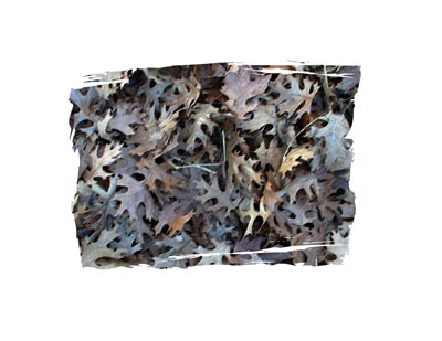
175. One Photo Many Techniques
I wrote this in January 2007 on my blog. I found it and thought it would make awesome inspiration for The Fun Extras class. See how I took one photo and used many techniques on it. Choose one technique and share your layout using the same.
TECHNIQUE 1
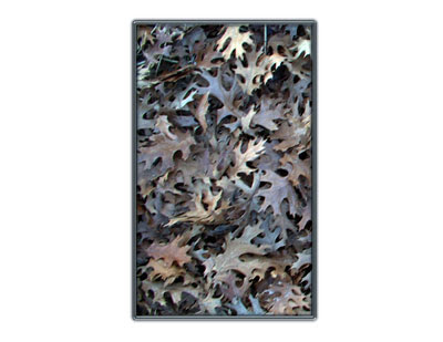
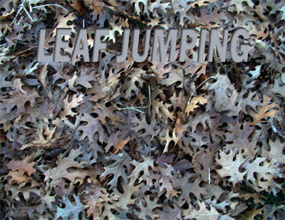
While in the park for a parade line-up last early December, I was surprised when I walked by this beautiful pile of leaves so late in the season. I had to take a few snapshots of them as I just knew I could use them digital scrapbooking some how. My dear family has to always be patient waiting on me as I stop to take photos of weird things all the time.
I have decided to take this photo and let my imagination run to share some tips and techniques that can be done with just one photo.
My first thought, for today, is to use the photo as a background.
One reason I love rectangle scrapping (11 x 8 1/2) is that resizing photos to use for backgrounds fits perfectly.
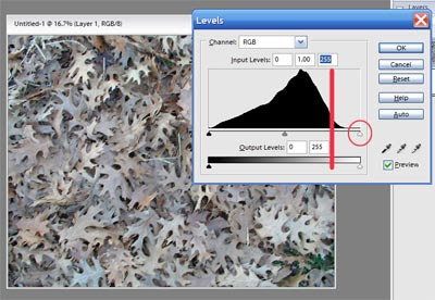
First, I notice that my background photo needs repairing. It does not look as vibrant as I remember the leaves. I always try the levels first, so I hit Control L. Oh my, yes, I need to move the slider over. In the screenshot below, you will note the hill. Just move the slider I have circled over until it reaches where the hill begins to go up, watching your desktop until it looks the best.
That made some nice changes to my photo, but it is still not vibrant enough. So, I made a duplicate of the photo and began applying blending modes to the top layer. I tested them all and decided that the "multiply" looked most like the real vision in my head.
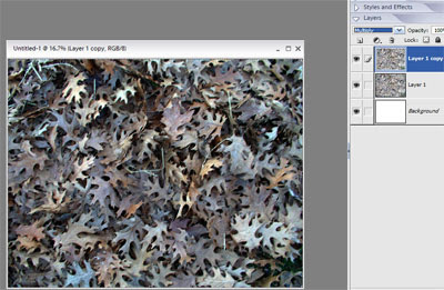
However, I could choose any one of the blending modes for the purpose of use as a background. Each and every one of them gave a whole different feel to the layout. Choosing a blending mode for a background may be just the inspiration you need for the theme of your layout.
Another thing to consider is contrast. In order for your photos to pop that you will be placing on top of this background, you will want the background to be either lighter or darker than your photos in order that your photos pop. My lesson 8A teaches about visual weight.
Make the background lighter or darker by either the blending modes or by reducing the opacity.
Okay, I must quit for today! I do believe I shared more than the intended one technique. Have fun!
TECHNIQUE 2
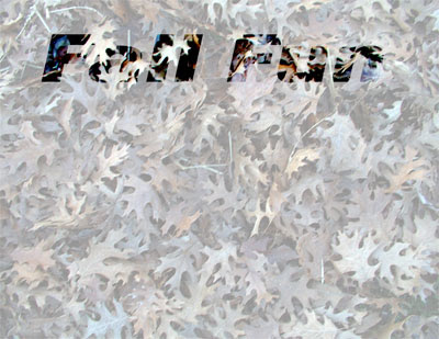
I have done this title technique on a layout before. Here are the instructions (in PSE, of course)
1. Lower the opacity of the background. (Of course, to do this, you must have a solid white layer below the background layer.)
2. Type the title.
3. Hold down the control key while clicking on the text layer in the layers palette. In PSE5, you must click on the icon in the layers palette. See marching ants? Great, you have a selection.
4. Make the background layer the active layer.
5. Hit Control J (to cut the selection out of the background and put it on a new layer). Having troubles? See this tutorial.
6. Change the blending mode on the new layer to Color Burn and make sure the opacity level of that layer is 100%. For fun, test other blending modes until you find one that works with your layout.
7. Smile. Today is a good day.
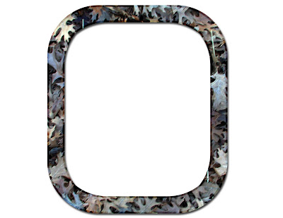
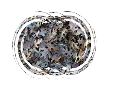
TECHNIQUE 3
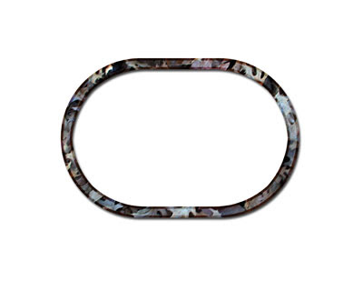
1. Create a shape on a new layer. Use the selection tools and fill in the selection with black or use the crop tool. Use your imagination and create a unique shape.
2. Hold down the control key and click on the layer of the shape in the layers palette. Do you see marching ants? With the background layer as the active layer, hit Control J to cut the shape out of the background. Having trouble? Click here.
3. Hold down the control key and click on the new layer that is cut out of the background. Do you see marching ants?
4. Go to the Select drop down menu, then choose Modify, and then Contract. In the popup box, type in a number. 100 is the highest number. if this does not make your frame wide enough, run the contract tool again. if 100 makes your frame too wide, hit the back button and test another number.
5. Hit the delete key to knock out the center of the shape, leaving a frame.
6. Add a stroke (border). In the stroke popup box, choose a width (I used 20), a color (sometimes color does not matter, but I used the eyedropper to get a color from the background), Location: Inside, and choose a blending mode (I used overlay and color burn on my samples)
TECHNIQUE 4
Okay, so right now my brain is stuck in text techniques. I will try to get something different up tomorrow and go back to text another day.
This text is fun because it appears like the background photo is cut out to see the solid paper beneath. Not! Here are the instructions.
1. Use the eyedropper tool to select a color from the background for your foreground color.
2. Type the title.
3. Apply a low "inner" drop shadow. Yep, that layer style is hiding in there and often forgotten! Go ahead, go find it!
TECHNIQUE 5
Making mats from a photo cannot be easier!
1. Use the crop tools or the selection tools to make a shape on a new layer. Use that shape as a template for cutting paper. See this tutorial or tips below in previous posts.
2. Add a stroke to the mat, if needed.
3. Add a stroke to a new layer and apply layer styles to it. My sample has the wow chrome layer style applied.