My Corner Online

These layout suggestion and layout re-do's were done as a part of Course 1, Lesson 8A, on Visual Weight. I invite you to be brave and participate by senidng me a layout. It is how I learned to grow in skills, with others giving me suggestions.
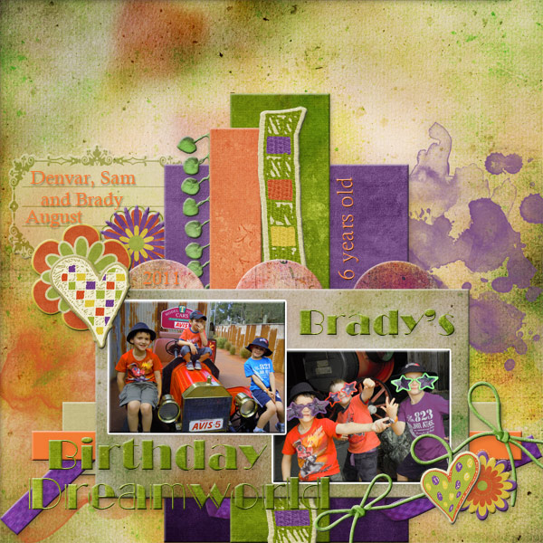
My first thought is odd for me as my eye actually first lands in the background area right below the "D" in dreamland. It wants to stay there. This is a unique happenstance from what normally happens, so I've had to think a long time as to why that is happening. I think it is because the rest of the layout is so busy, in addition to the bright solid color orange, that my eye tries to travel there and immediately jumps back to something more pleasing.
1. contrast - the white border on the photo is a good choice. However, the bright solid orange mat underneath the photos is actually detracting from the photos. It is brighter than the photos and therefore it is grabbing more visual weight than the photos. A deeper orange would create more contrast to leave the photos as the focal point.
2. size - The photos are a good size. However, the title is so large my eye actually goes to it second before trying to travel downward to the photos. To land in the center of the background, travel upward to the title, then downward is not good flow. My eye then thirdly lands on the beads. The beads are too large. My eye cannot get past the beads to stay on the photos. The size of the beads makes the layout feel too busy.
3. color - As indicated above, the bright orange of the mat and title are actually too bright and are taking visual weight away from the photos. I think if you would fill both of them with the next textured paper used elsewhere in the layout, it would feel better. In addition, in the photo, the clothing is red and blue. This makes only two spots for that color blue in the entire layout. With the rule of thirds, having each color in three places to lead the eye comfortably around the layout works well. With regard to the red, you do have some red in the beads, so that helps some.
4. shape - not applicable.
5. texture - the lack of texture on the mat and the title actually bring visual weight to them. Making both of them of paper to match the textures in the background would take away that visual weight problem.
6. isolation - not applicable.
7. value - The beads contain value, mostly because they are the only realistic item on the layout. There are two types of kits -- computer made and realistic. The realistic kits can be understood by thinking about how extracted flowers look different than computer made flowers. As said above, making them smaller would take away some of their visual weight. In addition, adding two other realistic items would also make a "rule of thirds." However, you would have to be careful adding because the layout is already busy for the eyes.
8. balance - Balance feels okay. If you take away the big title, it would be a "bottom-weighted" layout. The big title makes it more center-weighted.