My Corner Online

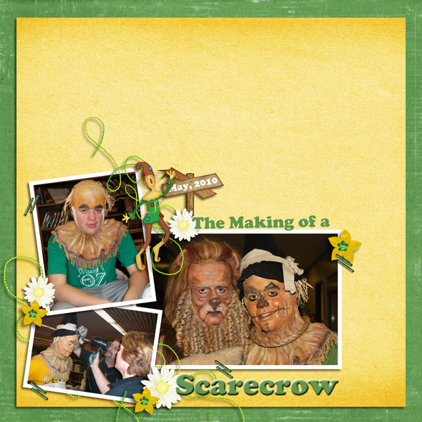
These layout suggestion and layout re-do's were done as a part of Course 1, Lesson 8A, on Visual Weight. I invite you to be brave and participate by senidng me a layout. It is how I learned to grow in skills, with others giving me suggestions.
1. contrast - The white borders on the darker photos were a good choice for contrast and I can read your text well.
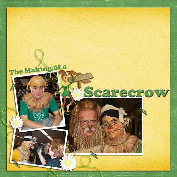
2. size - The word "scarecrow" might be too large -- I think my eye goes there first and then to the focal photo second." Don't be afraid to leave more whitespace on the right side. If that bothers you, try matting.
3. color - yellow and green are nice, but no color principle working to bring the eye to the photo.
4. shape - not applicable.
5. texture - not applicable.
6. isolation - Having everything in the bottom left corner does help to bring the eye to the photos, but because the word scarecrow is the first thing it hit after crossing the blank area, the eye goes to it first.
7. value - the flowers have some value, but I think they are small enough to be in check. You did use three of them and that is good for the rule of thirds.
8. balance - it feels balanced and grounded.
I would suggest, as I always do, journaling. These photos on this page are just like the photos of my grandma's I found in a box. I look at them and wonder what they were doing and where they were. If you don't want the journaling in public, then just insert it and then for the save for web purposes, change the text to say "my journaling is here" ...so we know it is there....I usually just change the names to the word "name" and then hit undo after I save for web.
You could even tuck the date on that cute sign.