My Corner Online

These layout suggestion and layout re-do's were done as a part of Course 1, Lesson 8A, on Visual Weight. I invite you to be brave and participate by senidng me a layout. It is how I learned to grow in skills, with others giving me suggestions.
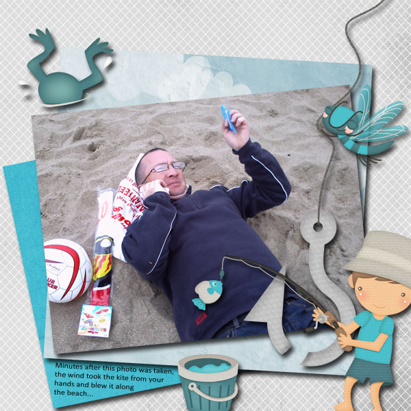
1. contrast - I can read the text okay; the dark color of his shirt is the only dark on the whole layout and that is what makes my eye go straight to the photo.
2. size - certainly the photo is very large....that design principle is working here. My eye goes second to the anchor. Is that what you would want? It's not wrong, just worth mentioning so you can learn.
3. color - most neutral colors, but the aqua of the bucket and firefly are the only two places this is seen and the rule of thirds might suggest you add a brad of the same color on the paper in the upper left corner so it creates a "triangle" of color. The same is true for the color the face --it's in one spot.
4. shape - not applicable.
5. texture - the pattern on the background paper would be considered pattern, but it is not an overwhelming pattern or color, so it is okay.
6. isolation - not applicable.
7. value - the anchor and the person figure have a lot of value. If the photo were not so large or if the contrast were not working for you, you might have problems, especially with their size.
8. balance - the balance is good. You are bottom-weighted, so that is good. My only suggestion would be not to put your journaling right up on the edge (although it does act to ground like it is, so a vellum mat might help if you move it away from the edge).
My only other thought is that I'm wondering if some of the layers should have a drop shadow for realism. I only see one layer with a drop shadow. Otherwise, you did a really good job with this.