My Corner Online

These layout suggestion and layout re-do's were done as a part of Course 1, Lesson 8A, on Visual Weight. I invite you to be brave and participate by senidng me a layout. It is how I learned to grow in skills, with others giving me suggestions.
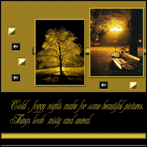
1. contrast - The light borders are good contract for the dark of the night in the photos. I can read the text well.
2. size - The photos are large enough, but the text is a little too large -- my eye is going to the text first and the photos second.
3. color - monochromatic color scheme that matches the photos is pleasing.
4. shape - not applicable.
5. texture - almost none, not applicable.
6. isolation - not applicable.
7. value - not applicable
8. balance - it's a little off balance... certainly top heavy (and bottom heavy is better, but rules are meant to be broken). I would suggest making the text smaller and not centering it, but tucking it into that space to the top and left of the photos, as well as somehow dropping everything down just a little bit so there is some "white space" at the top of the layout. "white space" is blank space . . always seems to work well to leave a little extra blank space at the top of a layout.