My Corner Online

These layout suggestion and layout re-do's were done as a part of Course 1, Lesson 8A, on Visual Weight. I invite you to be brave and participate by senidng me a layout. It is how I learned to grow in skills, with others giving me suggestions.
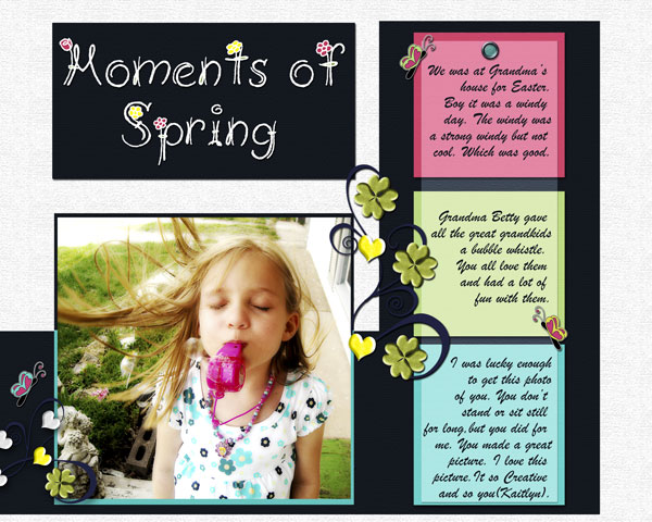
I darkened the white background a little so you can see it. I personally prefer the white background and will probably print it that way but for on line you cant see the white background.
1. contrast - I can read the text well -- no problem there! Also, black and white are the classic high contrast.
2. size - your photo is the largest and my eye does go to it first -- so you have achieved the main goal of the use of principles.
3. color - color is interesting choices. I like the black and then the blue border around the photo -- it creates artistic measure and the blue is from her shirt. However, that blue is only on the bottom of the layout in three places and although that is good to have it in three places (photo, border, box), it's not a "triangle" of 3 colors leading the eye around the page. Although the red, yellow, and blue is probably a triadic color scheme, something about it is not working for me and seems to fight with each other, rather than complement. You're kind of stuck if you are set on using those stickers because yes, a lady bug should be red and a bumble bee should be yellow. For me, I would have pulled the green and pink from the layout and used those as color blocks and then found elements (spring flowers or something) that worked. I generally do work with my photo and then work outward ...not letting the kit dictate what I use, but the photo. The yellow is so bright and keeps taking my eye away from the adorable photo.
4. shape - not applicable.
5. texture - not applicable.
6. isolation - not applicable.
7. value - the stickers do have value, but it is more their color and size that give me struggles, as indicated above.
8. balance - everything is grounded and yes, color blocking is always a good technique.
I do love that photo and the title that coordinates with it to give the photo meaning.
Don't forget to journal or the journal police will get ya!