My Corner Online

These layout suggestion and layout re-do's were done as a part of Course 1, Lesson 8A, on Visual Weight. I invite you to be brave and participate by senidng me a layout. It is how I learned to grow in skills, with others giving me suggestions.
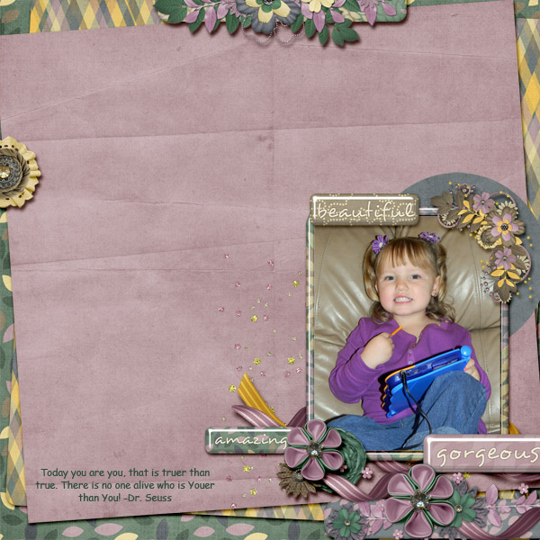
1. contrast - I can read your text well. The deep purple in her shirt is contrast to the soft colors everywhere else in the photo. That is actually working to make the photo the focal point.
2. size - My eye goes second to the cluster on the upper right of the photo and I believe that is because it is so large in comparison to your photo.
3. color - the colors of this kit coordinate well. There really is no rule of thirds working with color or the like as the color is just scattered everywhere so busy.
4. shape - not applicable.
5. texture - you have some textures (patterns) in your papers, but the way you have stacked them has kept them to a minimum and, therefore, they are just fine.
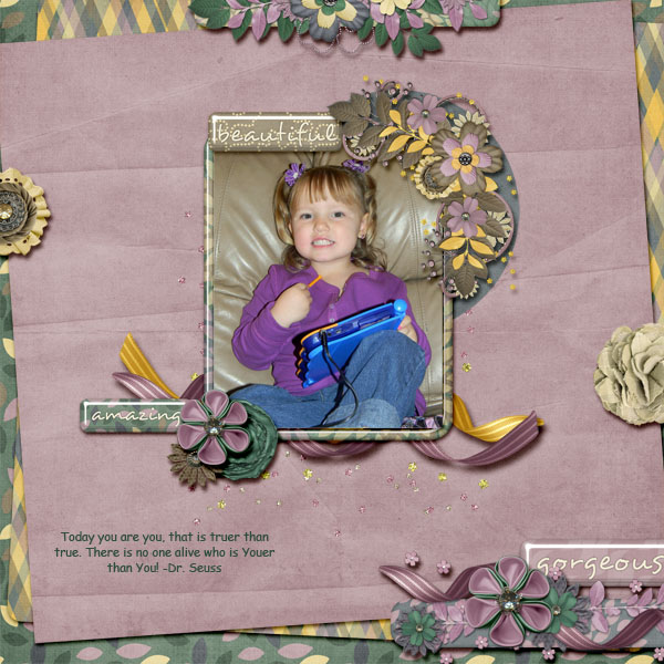
6. isolation - You do have some "white space" around your image, but it goes all the way around your image and, therefore, is not "working" as visual weight. If you moved all of the stuff in the middle towards one edge or corner, then that white space would work to lead the eye to the photo.
7. value - All of those clusters have a lot of value to them. Using so many of them actually makes my eye want to jump all around and the layout feels busy and my eye doesn't know where to settle. As mentioned above, the cluster on the upper right of the photo is the most difficult one. The size and value of it are working to compete with the photo. My eye keeps jumping to it while I"m looking at the photo. The clusters around the edges are not bothering my eye too much.
8. balance - There is a video lesson in Course 1 on grounding. The things in the middle of your layout are not grounded. They are just floating there. I would suggest watching the grounding lesson again. Also, it is center-weighted and bottom weighted things just feel better, so when you do the grounding, move everything in the center down just a tad. Or, you could ground and make bottom weighted by utilizing the isolation principle by dropping the photo to nestle in the clustering on the bottom right of the page.