My Corner Online

These layout suggestion and layout re-do's were done as a part of Course 1, Lesson 8A, on Visual Weight. I invite you to be brave and participate by senidng me a layout. It is how I learned to grow in skills, with others giving me suggestions.

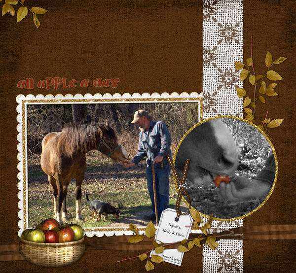
Most often, the goal in a good layout is that the eyes go to the photos first. If your eyes go to the photo first, then the photos have more visual weight than the other elements. There are eight design principles that come into play that effect visual weight.
1. Contrast - The dark brown paper is excellent for contrast on the photos. The photos really pop. Pammy changed the color of the title font to make its contrast better, yet didn't change it so much that it gained focal weight by being so bright. That was a great choice. Read more why that color choice was great in #3 below.
2. Size - The photos are large enough to keep focal weight and the elements are realistic in size.
3. Color - Color isolation on the apple in the circle photo comes into play on the layout to bring focal weight to the photo. The green leaves are in three places; the color red is in three places; and the color white is in three places -- each forming a nice triangle. The rule of thirds with regard to color is excellent in the re-do.
4. Shape - In the re-do, the circle photo is actually making that photo the focal photo, although it was originally meant to be the supporting photo. The change in placement of the circle to be over the larger photo somehow swapped which photo was the focal photo and which one was the supporting photo. I do not believe it matters which is the focal point, but the eye goes to one photo first and the other second which is what we want it to do.
5. texture - Not applicable in this layout.
6. Isolation - As mentioned, color isolation in the circle photo in bringing focal weight to that photo.
7. Value - The cute apple basket has value, but its size is such that it keeps the focal weight in check.
8. Balance - The before and after is a perfect example of what a difference a center-weighted layout is to a bottom-weighted layout! The bottom-weighted layout is much more pleasing to the eye. The ribbon from the top of the page to the bottom of the page serves to ground all of the other elements nicely.
There are many more examples just like this in the Subscriber Area from past students. As time goes on and more people take the class, this area is becoming a great resource for those wanting to learn design principles to make layouts better.
I, personally, am not artistic at all! I had to learn these principles myself in order to become a better scrapper. I have to think about them each time I create a layout and apply them. It takes time to learn an eye for them. Don't forget that you can post layouts there anytime.