My Corner Online

These layout suggestion and layout re-do's were done as a part of Course 1, Lesson 8A, on Visual Weight. I invite you to be brave and participate by senidng me a layout. It is how I learned to grow in skills, with others giving me suggestions.
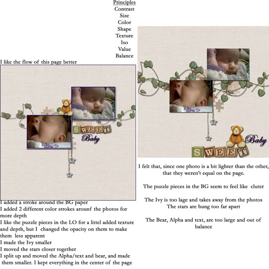
1. contrast - I can read your text okay. There is enough contrast on the photos, but it's not a big contrast. Adding the darker border around the photos did help. That was a good change.
2. size - In the before, the blocks/title were too large and actually they were the first thing I saw, so they were the focal point. The change you made was perfect to fix that problem.
3. color - The pink background brings out the pink in the cheeks. The blocks and bear have a color that is no where else on the layout, and this also brings the eye to them. Again, making them smaller did the trick. However, I have another suggestion. The green and blue blocks are okay, but observe how the red block are the only red on the entire layout. To fix this, either add red in two other places on the layout (rule of thirds -- in a triangle), or just change the color of the blocks. Make them orange like the bear. You moved the bear, so that would be orange in two places and I think that's the same orange in the middle of the hearts....that would be orange in three places in a triangle.
4. shape - It was a good choice to lower the opacity of the puzzle shapes.
5. texture - not applicable.
6. isolation - You do have isolation going on in the re-do. There is a lot of "white" space working to bring the eye to the photos.
7. value - You did well in reducing the amount of ivy and making the blocks and bear smaller...the block and bear did have a "cute value," which also brought the eye to it, along with its size and color.
8. balance - Your re-do is too centered -- too balanced. Bottom heavy layouts are better, so just drop the whole thing down on the page a bit. Also it is worth noting that the ivy does ground everything nicely.
So, I only came up with two small changes for you! You did REALLY well! I thank you for taking the time to write in your thought process. I can tell that you really did learn from this lesson. Give yourself a pat on the back from me!