My Corner Online

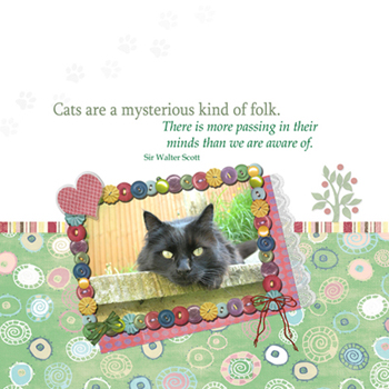
These layout suggestion and layout re-do's were done as a part of Course 1, Lesson 8A, on Visual Weight. I invite you to be brave and participate by senidng me a layout. It is how I learned to grow in skills, with others giving me suggestions.
1. contrast - I can read the text well enough. The cat is "black" and that is a great contrast from all the softer colors.
2. size - photo is large enough to keep focal weight.
3. color - I am a bit troubled with the highly saturated frame when there is nothing else on the page as highly saturated in color. On one hand, it works well because it helps bring the eye straight to the photo. The buttons themselves are not too large, so that works well for the frame. However, it would be my suggestion, just to make the layout "feel" better, to add a few of those buttons in two other spots on the layout....maybe one (or a little cluster) in the bottom left hand corner (which would help make this more bottom weighted) and maybe one button on top of the little red dot on the top right of the tree (in place of it). This would create a visual triangle (rule of thirds).
4. shape - not applicable.
5. texture - the print of the patterned paper would be texture, but I don't find it gaining too much focal weight, so it is in check..probably because of it's soft color.
6. isolation - not applicable.
7. value - that frame has value for sure, but it is discussed above how to fix it.
8. balance - The layout, although seemingly symmetrical, doesn't really feel balanced. Also remember that bottom weighted feels better. I would suggest lowering the photo/frame cluster down some more so that the top of it is slightly below the top of the tree. Then lower the quote. Leaving lots of space at the top is a good thing. The quote seems detached or may even be what is making everything feel unbalanced. Maybe angle it the same angle as the frame and tuck it right over the frame?
Also, I am not seeing any drop shadows. This layout would come to life with them, especially on the mat below the photo, as well as the lace on the mat, and the striped ribbon/border. Can you put one on the tree? Just check every single layer but the text to make sure it has a "soft" drop shadow on it.
This may seem like I've had a lot of suggestion, but I do want to say that this is not as bad as I made it sound! It's actually fairly good overall! In fact, my eye DOES go to the photo first, so you HAVE achieve the ultimate goal in focal weight. You go girl!