My Corner Online

These layout suggestion and layout re-do's were done as a part of Course 1, Lesson 8A, on Visual Weight. I invite you to be brave and participate by senidng me a layout. It is how I learned to grow in skills, with others giving me suggestions.
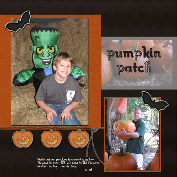
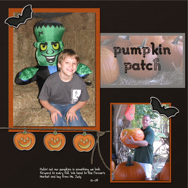
I changed the background b/c I thought the orange frame/border made the picture pop better (more contrast on the main pic)
I changed the size of the pictures to put focus on the one I really wanted.
I also balanced things a bit more "fun" (not so straight and narrow, I guess?)
Also put some vellum over the picture of the pumpkins to down-play them a bit but still have them as a great embellishment.
And I changed the hue of the orange paper to have it match better.
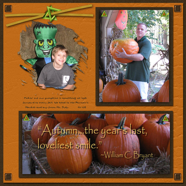
1. contrast - Dark backgrounds are perfect to make the photos pop. Great change!
2. size - making the photos larger was also a good thing!
3. color - all looks good to me!
4. shape - not applicable.
5. texture - not applicable.
6. isolation - not applicable.
7. value - the pumpkin charms have value, but are small enough to be kept in check.
8. balance - good. Might leave a tad more space at the top to make it a tad more bottom heavy.
You really did a 180 with the re-do and I like it a lot. If I had one suggestion, it would be on grounding. The layout IS grounded, but only by that stick, which doesn't seem to be quite enough as my eye keeps wanting to see the grey vellum resized and pulled to the edge. In fact, my eye keeps wondering what it would look like to leave the photos where they are, but resize both the grey vellum and the orange mat on the focal photo to the left and right edges, leaving the photos offset from the mats.
Not really necessary changes, but if I had any suggestions, that would be it. What a great re-do you did!