My Corner Online

These layout suggestion and layout re-do's were done as a part of Course 1, Lesson 8A, on Visual Weight. I invite you to be brave and participate by senidng me a layout. It is how I learned to grow in skills, with others giving me suggestions.
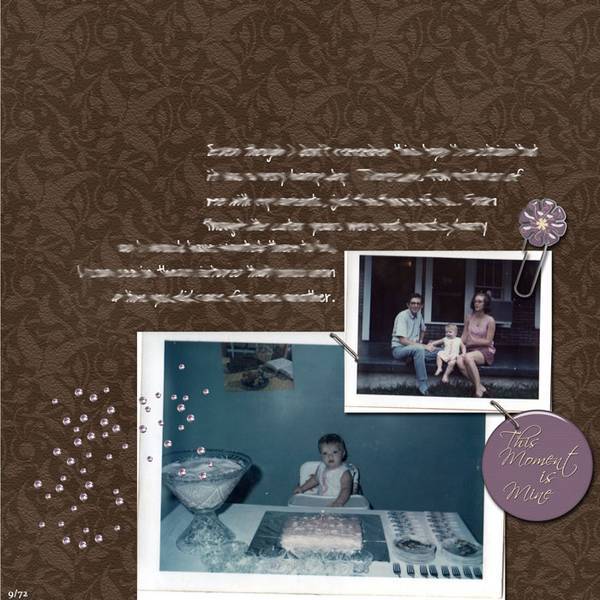
I wanted to put some journaling on it. But as it is, I couldn't get it on there anyplace that it looked good.
So, here it is...
Of course, I always encourage journaling! I'm seeing it hugging the photos so that you continue to have the isolation technique working....hug it around the top of the photos.
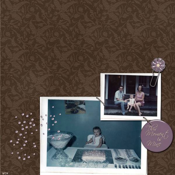
1. contrast - dark paper, white frames on the poloroids--perfect example of contrast.
2. size - photos are large to keep focal weight..elements nicely sized.
3. color - the pink in the tag and glitter actually pulls the eye to the pink in the clothing in the photos.
4. shape - not applicable.
5. texture - the pattern on the paper would be considered texture, but it is subtle and does not take away visual weight from the photos.
6. isolation - This technique is working very well here. You have a lot of "white space."
7. value - The tag and paperclip have some value, but the focal weight of them is not overwhelming.
8. balance - the good stuff is all in the bottom right corner making it bottom weighted which is good..
....soo...other than there being no journaling as mentioned above, I see nothing that needs to be changed.
***Thanks, Hummie. I did go back and put some journaling in, but I won't be posting that anywhere. It's rather emotional for me...both my parents are gone now...I'm not up to sharing the journaling at this time.
I understand. There are many people that feel the same way you do about sharing the journaling. So this must be you and your parents. Probably a true treasure of a layout for you.
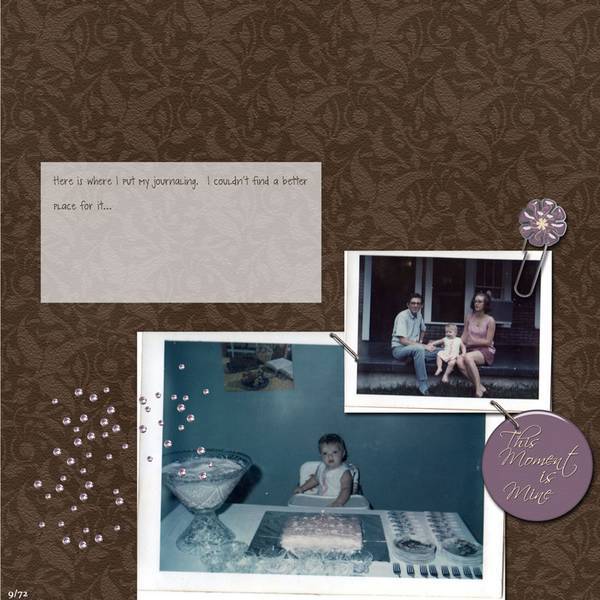
What I often do if I don't want to share the journaling, is to just replace it with fake works (like "my journaling is here, but I'm not sharing" over and over)......just for the internet copy....so people know you journaled and can see what it looks like with it in case they scraplift you.
It drives me nuts seeing in other gallerys all these layouts with no journaling!...I think they are mostly CT required layouts....so I like seeing layouts in my gallery to set it apart, even if it's fake replaced words for internet purposes.
You're right....the way you have it isn't working.
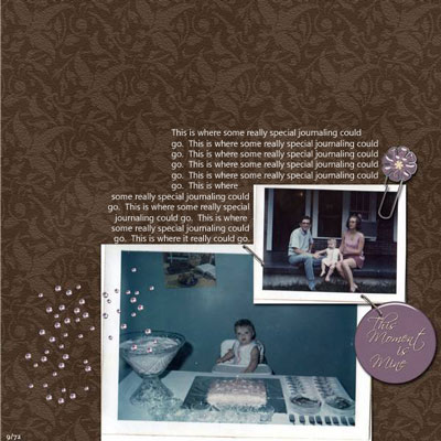
I am attaching an example of what I was describing and envisioning for your journaling. Is this better?
There are two text boxes. The top one is left justified and the bottom one is right justified so it hugs the photos.