My Corner Online

These layout suggestion and layout re-do's were done as a part of Course 1, Lesson 8A, on Visual Weight. I invite you to be brave and participate by senidng me a layout. It is how I learned to grow in skills, with others giving me suggestions.
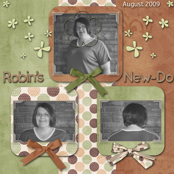
1. contrast - using black and white photos is always a great way to make sure things contrast. Your title is large, so having a less contrasting color is a good choice.
2. size - I do think that you have a size problem. My eye goes straight to the title in the middle of the page and gets stuck there. That is because the photos are so small. I would make the photos much larger. You have the rule of thirds going on here, so just continue it. You have the background divided into thirds, so make the photos larger so that they are one third on one section of the background and two-thirds on another section of the background.
3. color - I like the muted colors. I don't see any problems with the coordination and placement of them either.
4. shape -rounded mats help to bring focal weight to the photos.
5. texture - nice texture on the papers...so nice I think that it gets focal weight over the photos! But making the photos larger will decrease the space the paper takes and solve everything!
6. isolation - not applicable.
7. value - the flowers have value; however, you have picked the right color and size to keep the value of them from overtaking the photos. They're great as they are.
8. balance - Everything is balanced, but almost too much so! By making the photos larger and having them places over the division lines of the background paper as I said above, you will note how it breaks up the balance and allows the eye to move about the paper more. In addition, you have two photos at the top and one at the bottom. This is making the layout top heavy! Switch them around! In addition, your photos are not grounded! They are just sitting there in the middle of their section of paper, floating. Again, this is solved by my suggestion of placing the photos above (one-third/two-third) so that they are over the vertical lines of the background paper. The vertical lines underneath them will actually ground them.