My Corner Online

These layout suggestion and layout re-do's were done as a part of Course 1, Lesson 8A, on Visual Weight. I invite you to be brave and participate by senidng me a layout. It is how I learned to grow in skills, with others giving me suggestions.
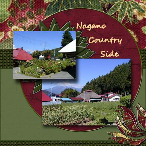
1. contrast - your photos are light/bright and your papers are dark, so this is working right.
2. size - the photos are large enough, so this is working right.
3. color - this is the principle that is mainly coming into play here. The blue sky in the photos is the only blue on the layout which is really making them pop. The papers have green and wine in them which pulls the wine roofs out of the photos.
4. shape - the circle is certainly pulling some visual weight, but this is a technique that is commonly found in sketches. By placing a shape, even something more unique than a circle, behind the photos as a mat, it actually serves to draw the eye to the photos.
5. texture - you have some strong textures on the top papers that are drawing some visual weight, but because the above principles are into play, it doesn't draw more visual weight than the photos.
6. isolation - there is some "white space" which is nice because it gives the eye a break, but actually it is the isolation of color as mentioned above that is working.
7. value - not really into play here
8. balance - for the most part, the layout feels balanced. The larger photo is on the bottom, but the two photos together as one are actually placed a little above the mean line than below, so this does feel just a tad top heavy. Also, having the white space at the bottom instead of the top lends to it feeling a tad top heavy. A simple fix would be to either put some journaling in the white space or to use my dotted line technique....just a small dotted line blended in so it doesn't grab too much visual weight. There's a lesson in course 2 on the dotted lines and I'm thinking it may need to be in course 1!
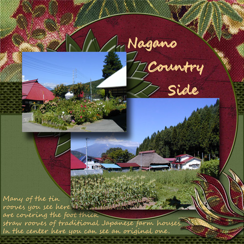
See, I think it looks better weighted with the journaling and the color of the journaling is fine for me as it matches the title. There's a bit of that color on the top paper too which actually bring into play the rule of thirds to balance out those two color places that you had at the top. Do you see what I mean? I actually think it was exactly what the layout needed to complete it!
Thanks for pointing out the other design principles you were considering when making this. It will help those others who come along to read and learn!