My Corner Online

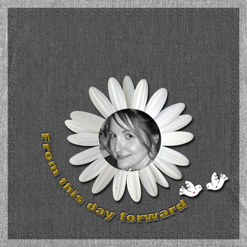
These layout suggestion and layout re-do's were done as a part of Course 1, Lesson 8A, on Visual Weight. I invite you to be brave and participate by senidng me a layout. It is how I learned to grow in skills, with others giving me suggestions.
1. contrast - I can read your text okay.
2. size - The photo and flower frame are large enough, of course, to keep the focal weight on the photo, but almost too large as there is no "white space" working.
3. color - You have no color to talk about.
4. shape - The flower frame I supposed would be a shape that draws visual weight, but with it and the photo so large, and with nothing competing against it, there's no problem.
5. texture - not applicable.
6. isolation - This is not applicable, but I think it would help the layout to have some "white space."
7. value - not applicable.
8. balance - it feels a little off balance to me and I think that leaving some "white space" by making the flower frame and photo smaller would help. It doesn't have to be a lot smaller. Your layout is "center heavy" and bottom heavy looks better, so leaving some space at the top would help....even lowering the birds to go with the smaller photo.
You don't really have enough of anything on your page to talk about in order to make this lesson valuable for you.