My Corner Online

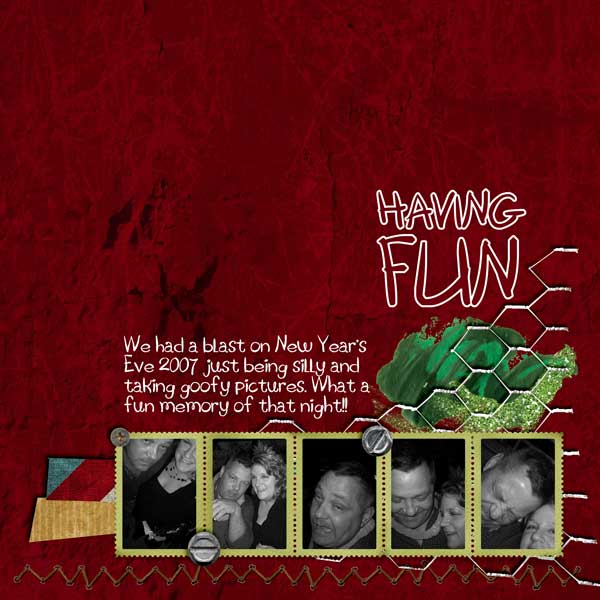
These layout suggestion and layout re-do's were done as a part of Course 1, Lesson 8A, on Visual Weight. I invite you to be brave and participate by senidng me a layout. It is how I learned to grow in skills, with others giving me suggestions.
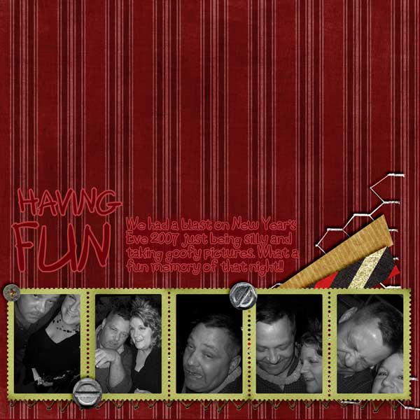
1. contrast - The white text on the red creates good contrast for readability. You mention using black and white photos to make them pop, but observe that they are not creating as much contrast as the white text. There is a tutorial in Course 2 that will help you convert those photos to black and white so that they will pop more with more contrast. Right now the photos are very dark. You have a medium green under the photos which has a slight contrast to it, but having something lighter would create even more contrast. This would be dark photos on very light frame. However, if you convert the photos to make them lighter and pop more, then then these frames may be okay as the dark red paper would help contrast them. Another option would be to apply a blending mode or lower the opacity a bit to the white text, leave it readable, but so that it does not have more contrast than the photos. There are MANY options you could take with contrast in this layout.
2. size - Note how big the title and paint splotch is in comparison to the photos. My eye did go to the photos first, but just barely. Upon second viewing, my eye seems to struggle to get away from the title and paint splotch down to the photos.
3. color - Green is only in two places. By placing a bit of green on the lower left hand side of the page, it would create a "triangle" and help to lead the eye to the photos. You only have one little splotch of blue on the whole layout. It is best to have a color in three places. You could even just convert that blue stripe on the paper to a green, but then you are left with a Christmas color theme. I don't find the tan paper being alone as much of a problem because it is more neutral, but the same could go for that paper.
4. shape - not applicable.
5. texture - not applicable really...but as a side note, because I know you are a more experienced scrapper, the texture on that background paper is not of good quality. For my trained eye, it is distracting to me. For an untrained eye it might be fine.
6. isolation - This is working well in your layout with all the "white space" which you call "negative space" (same thing).
7. value - The chained fence element might have value, but it seems to be in check just fine and doesn't grab too much visual weight at all.
8. balance- It is balanced. It is barely grounded by the wire that touches the edge in the bottom right-hand corner.
If you want to jump ahead into Course 2 to fix the black and white photos, look for the tinting tutorial.
However, you would only apply the black and white conversion in that tutorial to this layout. Save the tinting for when you actually get to that lesson. Look for the instructions on using a new adjustment layer to change it to black and white.