My Corner Online

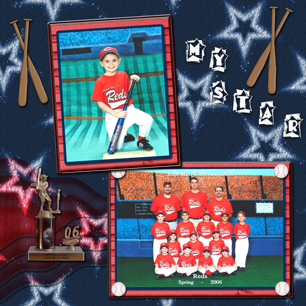
These layout suggestion and layout re-do's were done as a part of Course 1, Lesson 8A, on Visual Weight. I invite you to be brave and participate by senidng me a layout. It is how I learned to grow in skills, with others giving me suggestions.

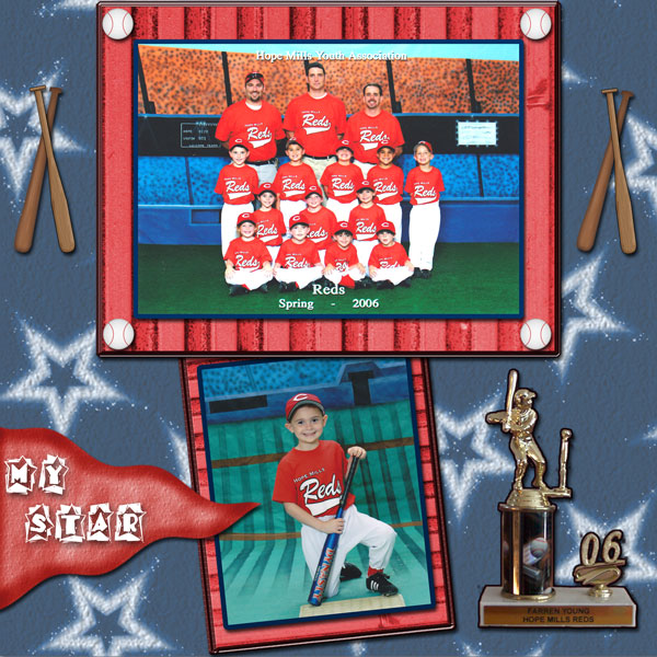
1. contrast - actually, the darker blue background creates contrast to make the photos pop. A darker red on the frames would do the same thing.
2. size - good on photos. That red wavy banner is also large and picking up some weight. My eye keeps going there second rather than the supporting photo.
3. color - That top frame is so bright...I think an easy way to fix it, though, would be just to make the focal photo a tad larger so that it covers up more of the frame, leaving less of the red bright.
4. shape - working against you with that wavy banner.
5. texture - wood texture on the frames is kind of cool.
6. isolation - not applicable.
7. value - That trophy has value. In addition, the font you used has value, but I actually cannot read what it says which makes my eye get stuck there also on that banner.
8. balance - this is your main problem with this layout. You are certainly top heavy. Put the focal photo at the bottom, almost always, as it is the largest thing, to make it bottom weighted. Sometimes I've seen them at the top and it pulled off well, but it's hard to do.
Try leaving some space at the top of the layout also. You don't need everything touching both the top and the bottom of the page.
Try a horizontal mat to ground things.....
Your trophy is necessary to the layout, but it is just floating...just plopped there on the page. I would try using that wavy banner to ground it....put it on the banner...that would help in two ways....to ground the trophy and also to reduce some of the area of the banner to take away it's problems.
