My Corner Online

These layout suggestion and layout re-do's were done as a part of Course 1, Lesson 8A, on Visual Weight. I invite you to be brave and participate by senidng me a layout. It is how I learned to grow in skills, with others giving me suggestions.
Oh goodness...don't fear and tremble! This is how I learned to scrap better...by being open to suggestions and taking what I liked and changing the layout or not taking the idea and leaving it for personal taste.
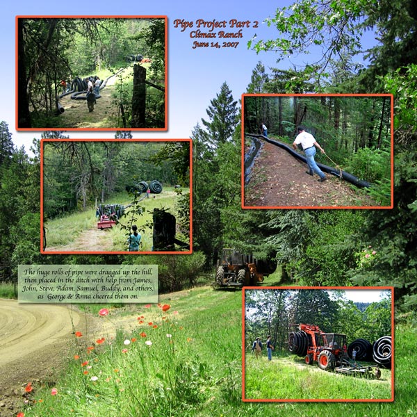
1. contrast - I can read the text okay, so the contrast is okay there. However, there really is no contrast in the frames. I would say the orange in the frames is also the same as the green of the photos....they are equal...neither is lighter or darker than the other.
2. size - The size of the photos is good. My eye certainly goes to the photos/frames first.
3. color - It is because the orange is so bright of the frames that my eyes go to the frames first. Actually, I feel as if the frames are getting the focal weight and NOT the photos. My eye struggles to get off of the bright frames to see the photos.
4. shape - not applicable.
5. texture -not applicable.
6. isolation - not applicable.
7. value - not applicable.
8. balance - Okay.
You mentioned wanting to leave the flowers and the driveway visible. So, my question to you is whether or not your intent is for the flowers and driveway to be the focal point or whether you want the photos in the frames to be your focal point?
If you want more of the focal weight to go to the background than the inset photos, then orange is a good color for the frames as it will help lead the eye to the flowers. However, maybe there is too much of a good thing? Maybe the frames need to be thinner? I would not know until I played with it and tried, but that is my thoughts.
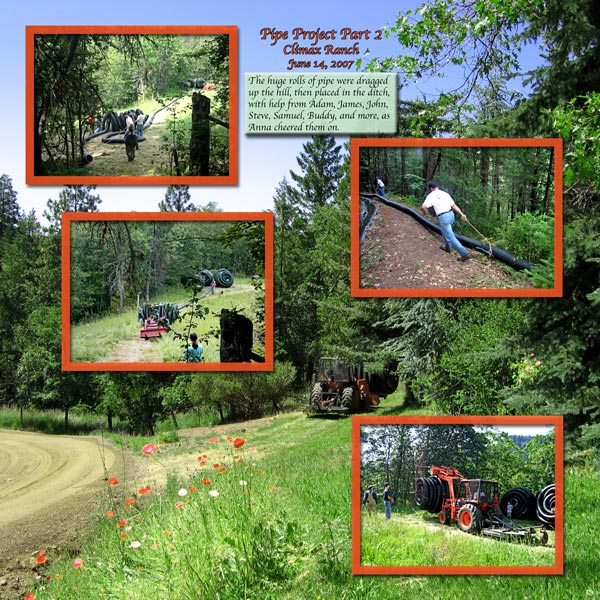
Oh, see what a small change can do! I am glad that you like it better.
Now, I have another small suggestion. I do like that you moved the journaling down. It helps bring the eye to the flowers and road and also helps to make it more bottom weighted.
However, you have an "artistic" type layout going on here and the bevel on the mat just does not seem to fit in with the theme. I think having a simple mat with lowered opacity, allowing the background photo to show through, would be a nice touch to have under the journaling. You'll have to get it just right to be able to still read the text, though.