My Corner Online

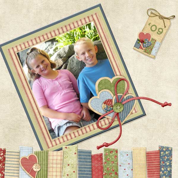
These layout suggestion and layout re-do's were done as a part of Course 1, Lesson 8A, on Visual Weight. I invite you to be brave and participate by senidng me a layout. It is how I learned to grow in skills, with others giving me suggestions.
1. contrast - Your photo is brighter than the slightly muted papers and I can read your text okay.
2. size - The size of your photo is what is keep the visual weight on the photo.
3. color - Pleasing --but then again..that's NitWit Designs!
4. shape - You have heart and tag shapes which are working a little to gain visual weight, but it's the value of them that works more against them.
5. texture - Patterns in the bottom papers would be considered texture, the the patterns are not too big...just right.
6. isolation - not applicable.
7. value - Oh, wow...you cannot use a nitwit kit and not have value working against you! It is hard sometimes to use these great kits and counteract the value in the elements. Making them smaller is the best way to counteract the value getting too much focal weight, especially the hearts, not so much the tag.
8. balance - The layout is top heavy and this is the main problem with the layout. The large photo is at the top of the page and, in addition, it is not grounded...it is just floating on the page. It could be lowered all the way down so it is partially tucked under the elements across the bottom of the page...this would not only help to bring the weight down, but the elements at the bottom would also ground it. However, that leaves your tag floating. So another option is to add additional matting underneath somewhere.