My Corner Online

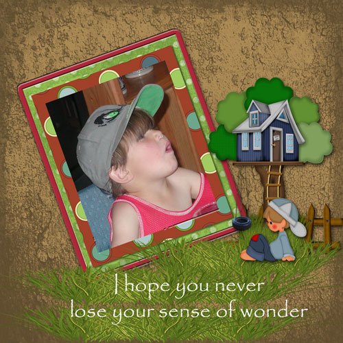
These layout suggestion and layout re-do's were done as a part of Course 1, Lesson 8A, on Visual Weight. I invite you to be brave and participate by senidng me a layout. It is how I learned to grow in skills, with others giving me suggestions.
1. contrast - I can read your text well. I would say that the frames/mats around the photo are "equal" in weight with the photo -- no contrast to help the photo pop, yet they don't detract from the photo either, so they are okay.
2. size - This is the big design principle working here. I think you photo is just barely large enough to keep the focal weight of the layout. My eye did go to the photo first, but just barely.
3. color - not applicable
4. shape - not applicable
5. texture - You have texture on the background paper, but it's not one that grabs any visual weight as it's just general grunge.
6. isolation - not applicable.
7. value - Oh, those cute little stickers have a LOT of value to them!--that being the treehouse and the little guy. It's a close call on whether they get the more visual weight, but I think the photo is just barely large enough to counteract the value visual eight of the stickers.
8. balance - If I had any suggestions, it would be on balance as this is a bit top heavy. Yes, you do have extra "white space" at the top which is good, but if you observe, both the frame/photo and the treehouse are accumulatively heavy together on the top half of the layout, leaving the grass to weigh it down at the bottom.
Making a little more "white space" at the top by making things smaller and then adding a fairly big title to the bottom might help to make it more bottom weighted.
It is an incrediably cute little layout though!