My Corner Online

These layout suggestion and layout re-do's were done as a part of Course 1, Lesson 8A, on Visual Weight. I invite you to be brave and participate by senidng me a layout. It is how I learned to grow in skills, with others giving me suggestions.
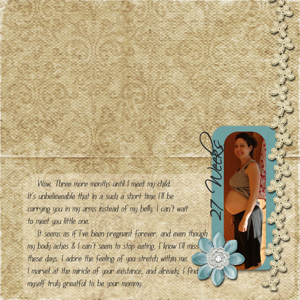
1. contrast - the photo on the blue mat gives nice contrast to your photo. I can read the journaling (which is great by the way), but I cannot read it easily as there is not good enough contrast between the paper and the journaling. I see three/four problems with your layout all with the journaling area. You said you thought it was the journaling as you had moved it, so you were right! You just need to analyze why it is not right in order to fix it. So, first, putting something under the journaling so it contrasts will fix this, but combine that with suggestion below.
2. size - My eye did not go to the photo first in this layout. Your goal is usually to have your eye go to the photo first. My eye actually went to that frame around the journaling first and I think that is because of its size and location at the top. My eye goes to that big flower second, not the photo. I'm not sure you need to change that flower though....it's border line okay.
3. color - The brighter blue behind the photo should be helping to lead the eye there, if the size of the other elements were not overpower it.
4. shape - not applicable.
5. texture - Nice texture on the background paper...that's contributing to the unreadability of the journaling, but I like it.
6. isolation - This should be working with all that "white space" you have to the left of the photo, but it is not because the eye goes to the frame first because it is at the top and gets stuck there, not really being allowed to push the eye to the photo.
7. value - The big flower also has value...two strikes against it, as I said though...not sure about it...it's borderline okay and you might be okay leaving it there. I don't think lowering it's opacity would look right. The flower may need some adjusting as that's two strikes against it.
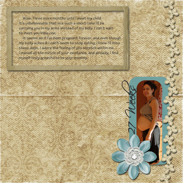
8. balance - You do have balance problems. The journaling at the top makes the layout top heavy instead of bottom heavy, so you were right to feel you wanted to move the journaling down. Moving it down will help to allow the isolation technique to work.
In addition (as I keep saying I need to do a tutorial on), your journaling is not grounded. Anything that appears to just be floating on a page is not grounded. To "ground" things, they must be touching something else that touches an edge. All that on the right side is grounded by the flower ribbon (which I love by the way...perfect color to enhance the layout too without overpowering the layout).
So, my suggestion for the journaling is to ditch that frame and add a paper with lowered opacity to it that goes under the blue photo mat also, but large enough to the left of the photo to fit your journaling on. Be careful to choose the perfect color of the paper. The paper has to help make the text readable without overpower the photo, hence the suggestion to lower its opacity. This would fix all problems with this one suggestion....it would fix the contrast for readability, the balance and grounding by the placement of it, and it would allow the isolation technique to work by allow the eye to flow down from the top and push the eye onto the photo by leaving the "white space" at the top. Isn't it amazing how one small thing can work with so many design principles? Do not put the mat all the way to the left edge as that would mess up the isolation principle. I would also suggest using the rounded corners on the mat to carry that feel throughout. Maybe even have the mat go far enough to the right that the two rounded corners on the very bottom right corner of the layout are offset and stacked to each other.
I hope all that makes sense! Just one small thing for the journaling and possible deal with that flower. You've got an amazing layout going on to start with!