My Corner Online

These layout suggestion and layout re-do's were done as a part of Course 1, Lesson 8A, on Visual Weight. I invite you to be brave and participate by senidng me a layout. It is how I learned to grow in skills, with others giving me suggestions.
First, thank you for being patient with me! I know this has been here a bit, but I just could not get to it. I'm usually more prompt, within 24 hours at least, but I am taking the time to put other things aside and get these done for you patient people!
It is good to try different sizes, just to see if we like them or not. I had trouble with square too, but the more I did it, the more I could see how it really has more room. I only do it when I plan a Shutterfly book though.
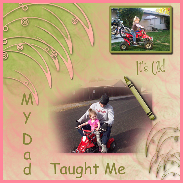
1. contrast - I can read the text good, so the contrast is good on the text. Both of the photos pop, so the colors you are using underneath the photos are good colors for contrast.
2. size - The photo is large enough, that is good -- both of them. However, I feel that the florish on the upper right is detracting from the photo. One design principle would be the size of it. It is larger than the photo. There are other principles at play too. Read below.
3. color - pink and green always look good together. I like that color combination. However, I am not sure they go with the red of the bike very well though. Often I try to coordinate the papers and elements with what is in the photo. If you decide you still like the pink and green with the red, then I would ask you to observe how the red is only in two places. The Rule of Thirds would have you add red in one more place to have the eye flow about the page.
4. shape - Not really at work here.
5. texture - The marbly look of your paper is at work a bit, but I don't think it detracts at all.
6. isolation - Not applicable here.
7. value - the florish that you have coming down from the upper right hand corner has a lot of value to it. My suggestion to repair the size and value of that element is simply to lower the opacity of that layer so it blends more into the background.
8. balance - It is very hard to achieve balance when you are blending a photo into a background paper. I even struggle with it. You have used the florishes in the two corners reaching into the photo to try to ground the larger photo, but I'm not sure it is working as well as it should. When things are not grounded, they appear to be just floating on a page. To ground something, having it touching something else that touches the edge grounds it. So if you would add a mat across the page somewhere, that would help. You could do it either on the lower two thirds or the upper one third horizontally.
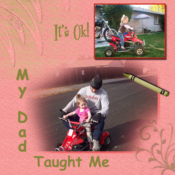
Well this is the LO with changes - A plain red outline on top photo is to much red for me so I used a combination of inside/outside stroke and used grn/red. Still not sure about the red but it makes sense 1/3's. Could be my eye or inexperience, or maybe even the way I did it. It was obvious after seeing the original that the picture was not large enough and that the background was controlling the focus. Anything else? I could have changed the whole LO but wanted to make changes to the original and see if I could see the difference. As I sit and preview this there seems to be a couple of existing problems to me. Both the left corner and the right corner seems to be too light. It just doesn't jump out and say Beautiful! I may still play with this some more, or not.
***
I think the changes you made were very positive! The florishes are not so distracting and grabbing focal weight now.
The only think that bugs me a little bit now is that it still feels a little top heavy, but you are probably tired of playing with this layout.
You're always welcome to try another layout to learn design principles at any time, just posting one in this layout suggestion area.
I think you are grounded a little bit better. Even though you didn't use a mat, the bottom right florish touches the large photo and then the top photo touches the large photo (overlapping it a bit), helping to ground the top photo.
The red frame works, but remember you could have always done something like adding a red crayon (except that would make a red and green Christmasy color) or to use red text. But the red frame does look a lot better to me.
it's amazing what watching a layout change can do to help everyone...even lurkers are watching, so thanks for being brave.
Don't overthink it...just keep things in the back of your head for next time.
My eye is certainly going to the photo right now and I'm thinking of what a great Dad you are.
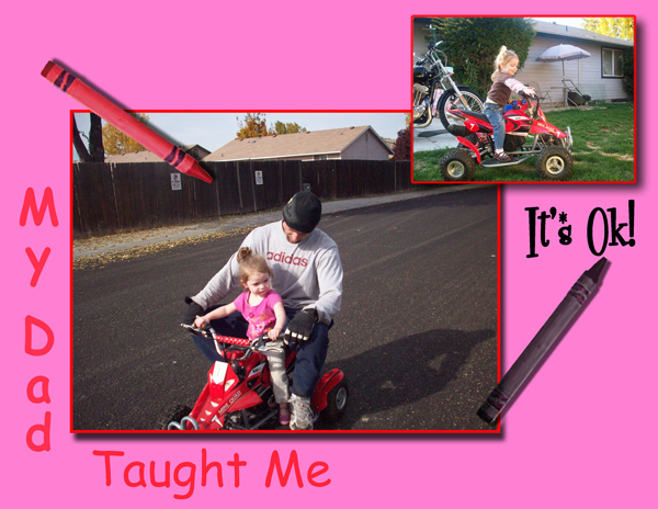
I just could not leave my last LO alone. It was outright gross. Now I humbly submit this next version of "It's Ok" - This is the back of a book that I hopefully will write for my granddaughter called "It's Ok". Just put in some pages of other examples of why it was ok. LOL as I just typed that last sentence I mentally saw another picture I can use. Maybe I will put together that book soon.
***
You are making me smile!
That's your best version yet! I think getting rid of that pink was the right thing to do! You are like me in that you have to keep at it until you get it right and learn it all.
I too say I have no natural artistic talent. Mine is learned, just as you are hoping to do. See, if I can teach it after learning it, you're going to be fine!
Those colors work very well with the photos and the border on the right certainly helps to ground it all very simply.