My Corner Online

These layout suggestion and layout re-do's were done as a part of Course 1, Lesson 8A, on Visual Weight. I invite you to be brave and participate by senidng me a layout. It is how I learned to grow in skills, with others giving me suggestions.
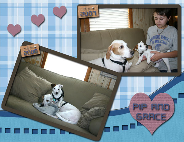
1. contrast - I can see your text okay, but I think you need to use some mats to make your photos pop. I think once you fix the exposure, you would want to go with a darker mat for contrast.
In addition, the exposure of your photos needs to be fixed. This tutorial is in Course 2's lessons, but I think you should take the time to learn it now. Time to do that Control L technique! This is especially a problem in the lower photo and the exposure was messed up because of the window.
2. size - photo are large enough. That's good!
3. color - I can see that you choose a color to match the dog's fir. The brown of the heart is the only place you have that color on the page. You need to either add two more hearts of that color and put them in two other locations on that page (visual triangle) or change the color of the heart to match the two mats you will be adding.
4. shape - the heart shape has visual weight. I'm not sure if making it a tad smaller would look better or not.
5. texture - You have some texture problems, in my opinion. I do not see these very often. Often, just using products from good designers takes care of this problem. The texture on the heart is okay, but the texture on the title mats is not good. For some reason, it draws my eye right to them instead of the large photos. It may be partly to the color of those tabs. Those pins are not realistic looking pins either. I think you will develop an eye for better downloads over time (not that mine are the best...I admit that!) I like the idea of the pins though! Just not those pins. In addition, there is NO texture on the background paper. Texture really can make a layout. The background is not bad, but from one who has a trained eye, it bothers me.
6. isolation - not applicable here
7. value - not applicable here
8. balance - Not too bad. You are sort of grounding because the two photos touch each other and then the one touches the edge, but I'd like to see some depth added to this layout by adding a solid color mat on the bottom one-third of the layout to break things up and to ground things better. It is amazing what background mats can do for a layout. Just have it touch both the right and left sides of the paper.