My Corner Online

These layout suggestion and layout re-do's were done as a part of Course 1, Lesson 8A, on Visual Weight. I invite you to be brave and participate by senidng me a layout. It is how I learned to grow in skills, with others giving me suggestions.
1. contrast - The mauve on the mat behind your focal photo is a perfect color. It accents the flowers in the photo and is a nice contrast to make the photo pop. Your title is readable.
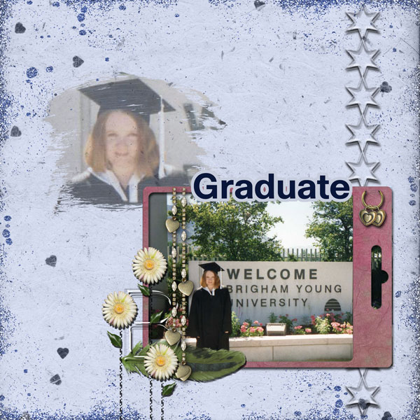
2. size - I feel as if the size of your faded photo is a little big. It actually got my eye first, but it may be because I was scrolling down the page (an interet problem not had in real life maybe). You have faded it, so that certainly counteracts the size which is a good thing.
3. color - No probems that I see.
4. shape - not applicable.
5. texture - grungy/glittery texture -- don't see any problems.
6. isolation - you have some white space which is important to have, but you have two spots of it which actually are competing for focal weight. Remember that nothing works as something. See balance suggestion below.
7. value - the stars and cute stuff on the frame contain value, but they are small enough that there are no problems.
8. balance - My one and only suggestion seems to be with balance. You are grounded, so that is good. The stars that run down to the frame and then continue off the left side of the photo down to the bottom, touching both the top and bottom, do ground the photo nicely. However, the faded photo is not grounded. It is just floating there, although it barely touches the frame with the grunge part. In addition, your layout is even weighted, rather than bottom weighted.
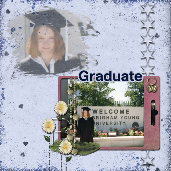
I would suggest that you make the faded photo just a TAD smaller and then tuck it so the bottom right of her chest is behind the frame. This would solve all the problems you are having. First, it would ground it. Second, it would allow the two blank (white) spaces to be connected causing them to not compete for focal weight. Third, it would leave blank space at the top which is often vital to creating a bottom heavy layout. Do not feel that you have to fill in all space. Leaving space at the top often is the simplest way to make the layouts feel better. Forth, it would fix the size problem that may be giving it too much focal weight.
You may have to move it all to the left to balance/center it again.
So, ONE simple movement ...you will be amazed I think at what one simple thing can do to improve a layout!
Oh...and can you somehow erase the grung off her face? If its on the background paper, maybe clone it out?