My Corner Online

These layout suggestion and layout re-do's were done as a part of Course 1, Lesson 8A, on Visual Weight. I invite you to be brave and participate by senidng me a layout. It is how I learned to grow in skills, with others giving me suggestions.
Cute journaling! It made me smile.
However, my first thought is how you explained to me about the title. You should never have to explain to someone viewing the layout about something. That's always a good sign that the journaling needs tweaking.
I appreciate you explaining the journaling size so I did not make a suggestion on that. I understand how shrinking layouts changes the size of the text also.
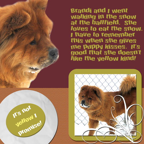
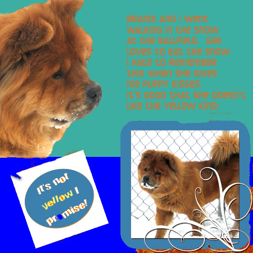
Where does my eye go first? The photo of Brandi with the white background, so that is good.
I see a lack of drop shadows being used. If your goal is to have the layout look realistic like a traditional page, I would not use the bevels on the frame and the swirl. The frame may be a drop shadow and not a bevel, but I cannot tell for sure.
I see no drop shadow on the photo itself, nor the tag, nor the tassle on the tag. You most likely do not want a drop shadow on the extraction and certainly not the text.
The color of your tag seems to not be in a color scheme. I see that you are trying to match it to Brandi's coat, but it's not quite working. I would suggest that you use the eye dropper tool to get two colors from her coat and then use them in the tag. Another option is to find something that works with the purple or the orange of coat and have those three colors in your layout. Opposite across the color wheel of purpose is yellow, but that would not work well with the orangeish coat.
I think a new color scheme would do wonders for the layout. I'm not at home to plug it into my program, but can do that later for you if you want. Or look on the links page above for a site where you can find a color scheme....I've plenty of links to other sites there.
I am seeing a problem with the "rule of thirds" in that you have white in two places (the photo and the title). The layout would be much more balanced if you had another place with white on it (keep reading).
I also see a problem with grounding. A simple white (third white) mat (I'm seeing a curved one) behind the title tag and the photo frame, having the top of the mat meet with the bottom of the extraction to give it grounding too, reaching from left edge to right edge, would serve to ground everything.
In addition, the lack of texture on the tag bothers me. Can you cut them out of papers or just add a little texture to them? Do you know where the texture filter is? I'm going to guess that a white mat may need texture too.
Well, those are my first thoughts. Play with that and, as always, changing one things makes you change something else! So I'll look again at the redo.
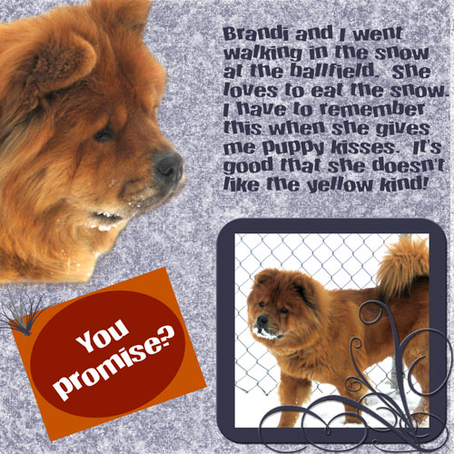
It's still not working, but I agree that the white mat made a big difference!
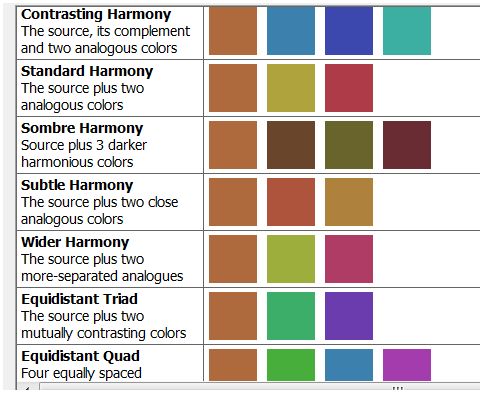
I got a brown color from Brandi's fur and used it to make some color schemes and I'm sharing them here. I see there are some purples in the lower rows....you may prefer them.
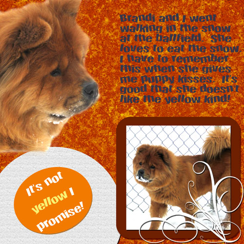
I roughly took your image and put the top color scheme into it quickly so you could see what it might look like.
It is important to note how the extra layer above the background and below the other layers serves to ground the layout. It not only gives Brandi's neck a place to rest on so it doesn't look like she's just stuck there, but it also grounds the smaller photo and frame and the tag.
I don't really like the blues, but you may. Of course, the layers may need some texture. Have you ever used the digital scrapbooking downloads? There are some free kits in the Subscriber Area you may want to try using. I find the pattern on your background too busy for my personal taste. I think its because the particles are so large...there's a tutorial here on using patterns and how they too can take up focal weight.
This below is the Sombrey Harmony color scheme. I liked how it looked better, but that may be a personal taste thing.
I used the brown in both of them on the text to give the brown of Brandi a third place to be in the layout (rule of thirds).
Just bring the above color palettes into your layout. Use the eyedropper tool to get the colors from the palette, then make that layer invisible. That way they are handy for you while you work with them.
I want to point out that we liked the white mat because it was serving to begin grounding, but you really need the entire rectangle to ground as in my example.
Also, I want to point out that I did not use the brown (or the orange as in your layout) behind Brandi because there is no rule of contrast. Be sure to use a complimentary color as the background....it's important. I think this is why your purple worked better than the orange....the orange had no complementary contrast. I really liked the wine color as the background. Some of the other colors were too bright for me and grabbed too much visual weight.
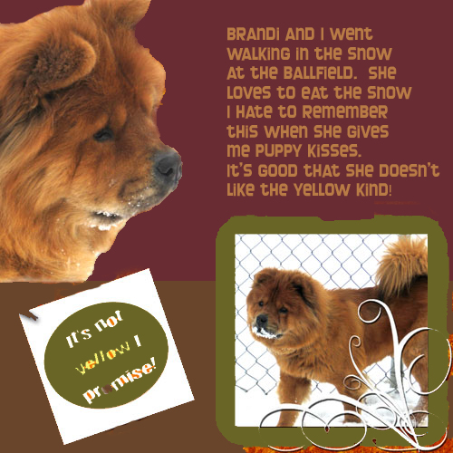
I am finally satisfied with this LO and love the burgendy and green combination! I think it really shows her coat off good even though she's a "red chow". I really, really appreciate all the help given!