My Corner Online

These layout suggestion and layout re-do's were done as a part of Course 1, Lesson 8A, on Visual Weight. I invite you to be brave and participate by senidng me a layout. It is how I learned to grow in skills, with others giving me suggestions.
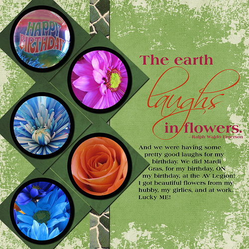
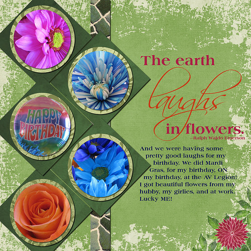
1. contrast: I can read text well. There is black around the photos which dark with bright is contrast, but the color black may not be best choice. Black isn't really "pretty" like the flowers. It's harsh.
2. size - Photos are large and my eye does go to them first because of this.
3. color - You have three blue photos going down the left side and "rule of thirds" is good to utilize to carry eye around the layout, but since it is blue all on one side, it doesn't carry the eye but straight down the side. There is no blue anywhere else on the layout, so the eye gets stuck there. Also, there is only one spot of bright pink (bright!) and the eye goes there first and gets stuck. There is one orange flower and you did use some orange text for title, but that is orange in just two spots (not three). Mixing up the placement of the flowers and adding more of the flower colors using small elements elsewhere on the page would help greatly.
4. shape - circles and diamonds that are large for photo mats helps draw the eye.
5. texture - not applicable.
6. isolation - not applicable.
7. value - not applicable.
8. balance - Okay, except it is really "centered" and bottom weighted would help, as always. It is grounded also.