My Corner Online

These layout suggestion and layout re-do's were done as a part of Course 1, Lesson 8A, on Visual Weight. I invite you to be brave and participate by senidng me a layout. It is how I learned to grow in skills, with others giving me suggestions.
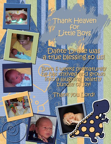
What I notice first is that some of your photos need the levels adjusted on them. Have you ever done that? You use Control L on the keyboard. There is a lesson in Course 2.
For me, my eye goes to the title first. Although it is not all that large, it is larger than most of the photos and size is one factor that gains visual weight. I would probably make all the text smaller. We need to remember that smaller text reads fine when printed and not to judge its size by small files for galleries.
There is no contrast behind the journaling text. (the paint stroke behind the title does give it contrast) I can read it fine, but it is competing with the busy papers behind it and my eye keeps getting stuck there confused and I have to force it to get on over to the photos. (See below suggestion to change background to solid color as this would fix that problem or you could put a piece of vellum behind the text.)
Also, for me, the background paper with its large stripes is grabbing too much visual weight. It is making the layout busy and my eye gets stuck on it rather than going to the photos. It is very hard to use patterned papers correctly and that's why I have developed some rules for using it in one of the written tutorials. That is why you do not see me using it very often myself.
I would tend to use a solid color paper on the background of this layout, but those little prints on the paper that you used on the star are just fine. They do not carry too much visual weight. Another alternative would be to cut a small strip of the striped paper as a border at the bottom of the page and then have solid color from there to the top.
The dinosaur is also larger than the photos and carrying some visual weight away from the photos. Also, the cuteness of an element will draw visual weight to it. However, the dinosaur is providing some needed weight at the bottom to keep this layout bottom heavy.
Can you turn the dinosaur so he is looking inward. Right now he is looking off the page and our eyes tend to follow where the eyes in a layout lead us.
I love the collection of photos you gathered and the journaling is precious and just explains the photos perfectly.
What if you used the striped paper in the area inside the star and moved that solid color blue paper to the background.
Just remember that patterned papers used in small amounts compete less and draw less visual weight away from the photos.
Please do share any re-do with us so that we can all learn together!
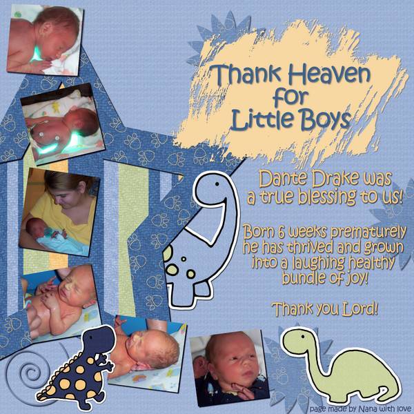
Much better! Whoo hoo! I see you took those frames off each photo and I like that better too. I do not use frames for the very reason which was shared in your layout as if they are too thick, as some designers make them, they overpower the layout. Great choice in taking those off. I wanted to mention it, but was afraid to say too much! lol.
I've only one small suggestion now. Now that you've taken off those big frames, put a small white stroke/border around each photo to make them pop. A white border would be the best color for this layout and match the dinosaurs too.
One more suggestion! I was looking at this from across the room while getting dressed and noticed that the paint splatch behind the title stands out grabs attention. It is now brighter than anything else on the layout and it is the first thing I see. In addition, it is almost the only thing on the page now (with the exception of the other text) with that color because you removed the frames.
Change it to that light green of the bottom dinosaur.
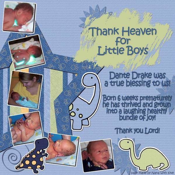
![]() Whoooo hoooo! I like this much better! I hope you are happy with it! Changing the text color helped too.
Whoooo hoooo! I like this much better! I hope you are happy with it! Changing the text color helped too.
![]() <----------- dancing with ya!
<----------- dancing with ya!
Doesn't it feel good to watch things change and then to be able to sit back and feel great about a layout and to have others encouraging you saying it's perfect too? Ah...love that feeling!
I analyze too much, but take note how now the green is in three places in a triangle; that follows the rule of thirds -paint splotch/dinosaur/striped paper.