These layout suggestion and layout re-do's were done as a part of Course 1, Lesson 8A, on Visual Weight. I invite you to be brave and participate by senidng me a layout. It is how I learned to grow in skills, with others giving me suggestions.
1. contrast - I can read the title okay, but struggled a bit with the red text. The red text is large enough, but I don't know if it is the contrast or the font, but for some reason I had to work to read it.
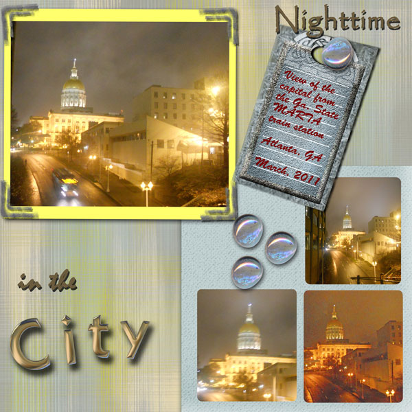
Your focal photo at the top has bright lights in it, so to make that photo pop, a contrasting mat underneath (a dark mat) would really make the lights of that photo stand out. The blue mat underneath the other photos is a bit darker than the yellow under the focal photo, but it could be even darker to really accentuate those photos too.
2. size - The size of the focal photo is good to bring focal weight to it, but actually, because of #3 below, my eye is actually going to the mat of the focal photo first. Then my eye actually goes to the tag second before it struggles to go back to the focal photo. I believe it is doing this because of the size of the tag. You want your eye to go to the focal photo first, then the supporting photos, before it travels elsewhere on the page.
3. color - Because the yellow mat is so bright, my eye goes to the yellow mat first. I realize you were trying to coordinate with the yellow lights in the photo, but anything that is bright is hard to work with as it brings so much focal weight with it.
Also, you have red text, but it is the only place on the entire layout with red. That makes the eye go to it first. Remember the rule of thirds applies to color also. Always try to put a color in at least three places on your layout for balance.
The same is for the yellow -- the yellow of the mat is in one place -- so this is a big reason why the eye goes to the mat first and then the tag/red text -- first their size, then their brightness, then the isolation of the only place for that color.
I like to get colors from the photos for my text and then make them dark enough for readability.
4. shape - not applicable, although I do like the rounded corners on the focal photos.
5. texture - not applicable.
6. isolation - not applicable.
7. value - not applicable.
8. balance - Your layout does have several balance problems. First, in general, people read from the left to the right. My eye is struggling to go from the top right to the bottom left for the title. It wants to read the bottom left first and then go to the top right.
Your layout is very top heavy and bottom heavy layouts just feel better. Your large focal photo and the large tag are both at the top of your layout. I believe if you move them both to the bottom and move the support photos upwards, you'll find that the whole layout just feels better.
Also, be sure to leave some blank space without photos or elements at the top of the page. Remember that you do not need to fill every space on your layout. Giving the eye a place to rest is a good thing. Leaving that place of rest at the top of the layout is a good practice as it allows for the bottom weighted layouts.
It is good that you allowed the blue mat to touch the edges and then the focal photo/mat to lay on top of the blue mat as that "grounds" the layout to the edges. You always want to try to have something that touches something that touches the edges to ground things. Floating things are not good. That's the main purpose of matting, I feel (other than creating contrast).
In addition, you do not have any drop shadows on the three supporting photos which makes it unrealistic.