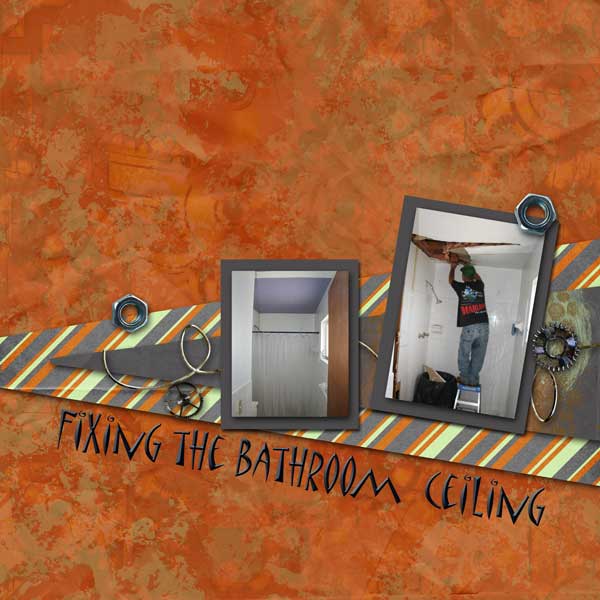
These layout suggestion and layout re-do's were done as a part of Course 1, Lesson 8A, on Visual Weight. I invite you to be brave and participate by senidng me a layout. It is how I learned to grow in skills, with others giving me suggestions.
1. contrast - I can read your text good, so there is contrast there. However, there is no contrast on the photos against the papers surrounding it ...they are equal in strength and so there is nothing to make the photos pop. A simple mat or border that is dark, because you have light photos (with all the white tub & surround), would help.
2. size - The photos are much smaller than most all of the elements and papers and this is another reason they are getting lost.
3. color - The color is very pleasing to me. There isn't any applicable color principle, however, leading the eye to the photos. Which is okay, not all principles need to be applicable.
4. shape - The two triangle shapes are certainly working here, especially since those shapes are isolated. It brings the eye straight to the middle of the layout. I always do like angles!
5. texture - the stripes on the triangle shape are considered texture, so the shape, texture, and isolation techniques are all working together to bring the eye straight to that part in the middle of the layout.
6. isolation - see notes on shape and texture.
7. value - The washers have some value as they are such great looking elements. Their size also makes my eye go to them.
8. balance - a little top heavy -- could move the whole thing down a little bit on the background.
So, overall it is a very pleasing layout, but I do have to say that my eye went to the photo last. There are some small things you can do to fix it -- shouldn't be too hard!