These layout suggestion and layout re-do's were done as a part of Course 1, Lesson 8A, on Visual Weight. I invite you to be brave and participate by senidng me a layout. It is how I learned to grow in skills, with others giving me suggestions.

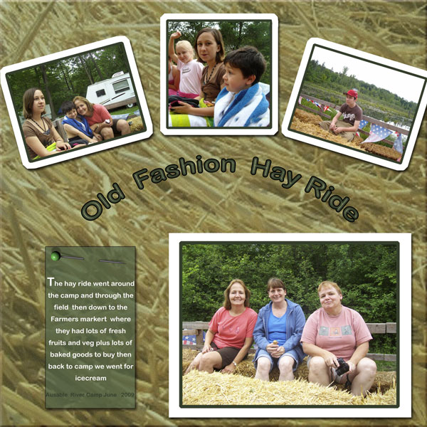
1. contrast - everything is readable. I think you needed the bright white journaling text to help balance out the white of the frames. I think the white frames are making the photos pop.
2. size - title is not too big, which is good...it has just the right amount of focal weight. You have the largest photo at the bottom which is good...the focal photo....so as to make the layout bottom heavy.
3. color - I like the lowered opacity on the tag. That works really well. I see you did something to dull the hay in the background so as to keep it from grabbing to much visual weight, which IS a good thing. However, I just feel funny about it...it doesn't look as much like hay any more....is somewhat unrealistic....maybe you dulled it too much?
4. shape - the arch of the three top photos is shape working as a visual weight. In fact, it brings the three photos together as one, making it a very large area (together). Collectively, it brings in more visual weight that the focal photo at the bottom. I am wondering if you made the white mats thinner if this would help. Also, see balance suggestion below.
5. texture -you've got texture in the hay background and have done good thinking to dull it, but there's what I wrote above about the hay.
6. isolation - not applicable.
7. value -not applicable.
8. balance - You do have some balance problems. First, as mentioned above, the three smaller photos seem to make a set because of the three making a shape together. Therefore, your layout seems top heavy, rather than bottom heavy. Remember, that it is okay to offset the balance a little bit by leaving blank space at the top of the layout. I would suggest making them a little smaller and then dropping them down on the page to allow for "white space" above them.
Also, you have grounding problems (which was not in the tutorials but I will find time to write about some day!)
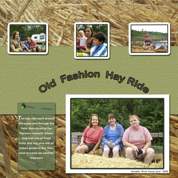
You do have the three photos at the top touching the edges, but everything is just floating on the page. This is where having a mat that stretches from one side to the other and then having everything else touching the mat creates grounding.
I would suggest a mat from left to right highlighting the title over it, but make the mat large enough so that you can rest the photos at the top and the stuf at the bottom on the mat also...just barely touching/overlapping the mat.
I think you will see once you create one how instantly something so simple changes your whole layout. First, it will ground everything. Second, it will break up the texture of the background that you have dulled...allowing you to leave the hay more realistic because there will be less of it. Third, it will set off your title without giving it focal weight.
I know that all of this is a lot to absorb...so just play...play....play! Just play until something says ....hey...that's it!

Ahh...much better! Isnt' it amazing what a simple solid color mat will do?
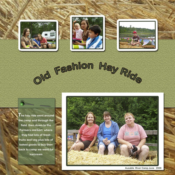
Now I think you just need to fix the balance a little bit. I can see that you left the space to the righthand side of the top right photo to equal that of the photo below and, thereafter, matched the same size space to the left side of left top photo. Then you lined up the middle photo to center over the title. You lined up the title between the bottom photo and tag. However, the stuff at the bottom is not really centered, throwing everything off.
I can see how you were paying close attention to it, but you did not quiet get it. The unqual space between the middle top photo and the outer photos is not equal and that is what I spotted first.
Try centering the title first and then position the bottom things from it and the top things from it. It is okay to move the top photos closer together and leave more space to either side of them than what is at the bottom.
I really like how I can see the shadow of the pin now that it is on something darker.
