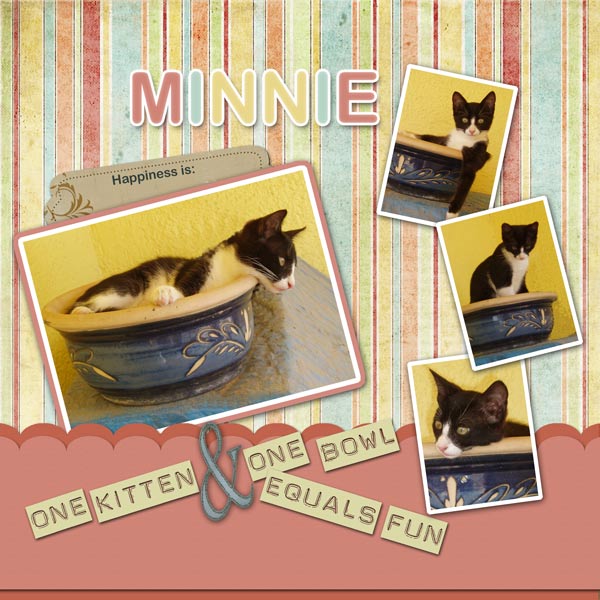
These layout suggestion and layout re-do's were done as a part of Course 1, Lesson 8A, on Visual Weight. I invite you to be brave and participate by senidng me a layout. It is how I learned to grow in skills, with others giving me suggestions.
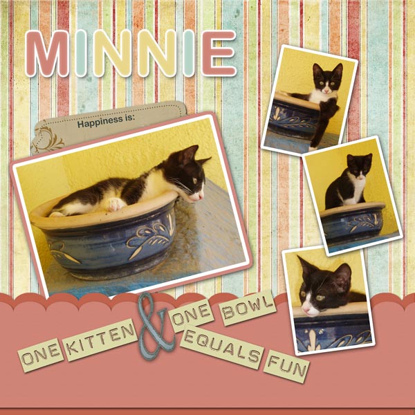
1. contrast - I can read your text well. The white borders contrast nicely with the black fur of the cat to bring the eye to the cat. At first I thought about how it didn't contrast well with the yellow in the photos, but noted it still worked. Then I realized it worked because it contrasted the black fur.
2. size - all is good!
3. color - The paper colors are a bit softer than the yellow in the photos which helps them to keep visual weight on the photos.
4. shape - You have a border which could draw visual weight, but since it is just a solid color it does okay.
5. texture - the stripes would be considered texture. To me, my eye almost goes straight to the stripes first. It's a close call as to which my eyes go to first. By using less of a pattern on a page, you could keep this in check.
6. isolation - not applicable.
7. value - not applicable.
8. balance - the border and having all of the photos touch the border helps to ground the layout. The layout is a little top heavy though. I would make the title just a tad smaller and bring it down. The title does not need to be centered in the empty space, but rather could be used to make the layout more bottom heavy.