These layout suggestion and layout re-do's were done as a part of Course 1, Lesson 8A, on Visual Weight. I invite you to be brave and participate by senidng me a layout. It is how I learned to grow in skills, with others giving me suggestions.
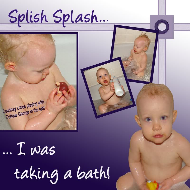
What a cute layout! I think you've done a great work here and have done so many things right. You have the larger photos and extraction as a focal point and then supporting images. You have light photos with a dark mat for great contrast to make the photos pop. The gradient background is simple and doesn't take any visual weight away from the photos while enhancing them at the same time. The title's contrast is just right and very readable. You've tucked a tad of journaling in that which I always look for (you may want a date on there somewhere though).
If I had any suggestion at all, it would be that it isn't grounded. I don't have a tutorial to explain that yet...need to write one some day. But basically, if sometime is not grounded it is "floating." The left photo is grounded to the edge, that works fine, as well as the extraction. However, the smaller photos are floating.
Look at Course 2, Lesson 10. I use these lines all the time in layouts. If you made a run of dotted lines behind the floating photos to the right edge, that might ground them just fine...just something as simple as a row of dotted lines can make a bid difference in a layout.
Or maybe better would be a line from underneath the "splash splash" toward to smaller photos. It's hard to put down in writing what I'm visualizing. I can see some possibilities for some vertical runs of dots too....for instance, maybe just a run from the small photos down to the extraction would do the trick instead.
You'd just have to play (isn't playing fun?) until you got this simple thing in just the right place to ground it and also to give it the right balance.
I don't see any drop shadows either....but this kind of layout might not call for them either....it may take away from the effect you have going on.

Basically..you are either grounded or you're floating....lol..
An element can be grounded simply by it touching another element that is touching another element that is touching another element that is touching the edge. Does that make sense? Just don't float the boat! Giggle.
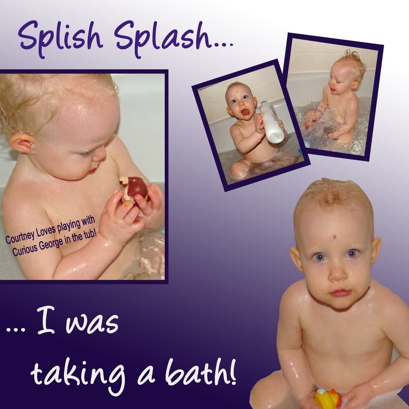
Here ya go...my quick example of one of the visions in my head...see how this feels better because it's grounded...and how simple it was to ground it?
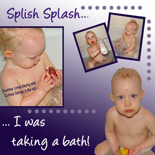
This also grounds, but it also has the effect of leading the eye (do you see how it leads the eye?)