These layout suggestion and layout re-do's were done as a part of Course 1, Lesson 8A, on Visual Weight. I invite you to be brave and participate by senidng me a layout. It is how I learned to grow in skills, with others giving me suggestions.
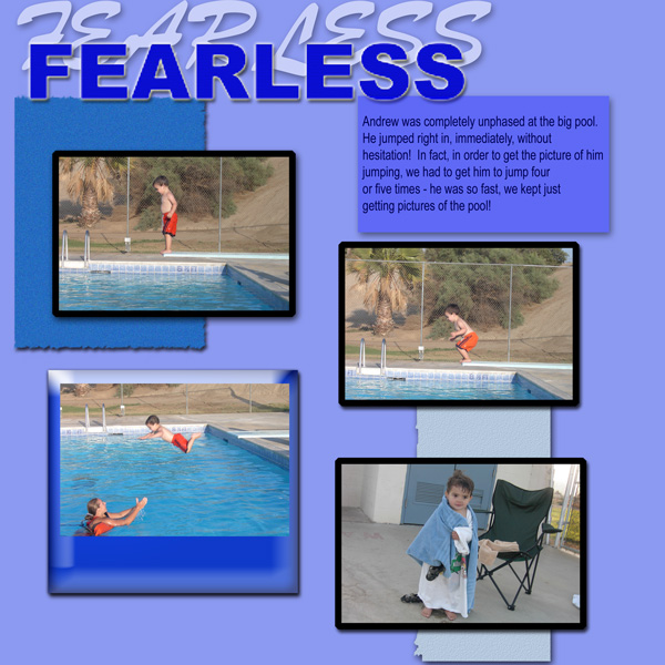
I love the pics, but my eye keeps on getting drawn away from them to the title. Could you move the title to the bottom and instead ofusing fonts that are so drastically different find ones that complement one another? My elementary art teach always had me put the title at the top and when I started scrapping it was a hard habit to break. Putting titles at the bottom actually helps to make the layouts bottom heavy.
The title is large and also bears a lot of visual weight, so just making it smaller would help.
However, what is carrying the most visual weight in this layout is actually those black mats. My eye goes right to them as they stand out because of their huge contrast and then my eye is all confused!
You were right to use a dark color under your photos as your photos would be considered "light" photo. I would take my eyedropper tool and grab a darker blue from the waves in the water and use that color (if it looks right--sometimes I find them odd colors after I grab them..lol).
With regard to the photo on the bottom left, the bevel is too high on the frame with it and it actually is distracting from the photo.
Here is my big suggestion, however. This will change the layout a lot and make you almost start all over. I note that you do have four photos which is perfect for having one focal photo and three supporting photos. So choose one photo that best tells the story and crop it to zoom in so we can see Andrew really well. I would suggest the one of him with his towel...you do not need to see the chair to the right of him, nor the concrete to the left of him. Crop it in close to him and make it larger as the focal photo. Then position the three smaller photos somehow to support that photo.
Now, for the compliments! Gotta make you feel good too!
I really like the offsetting of the mats under the photos....this shows you've got an artistic side in you just screaming to come out once you get some design principles down---you're going to do great! You utilized those mats just right!
Also, grand kudos to you for that great journaling! You are a natural at the journaling and in the end, it won't matter what's on the page 50 years from now---they are going to be reading your words and understanding those photos and the story perfectly. Oh, but I like to tuck a date in somewhere (even ever so small) on my layouts...every one of them....if they ever get e-mailed or separated from your photos....that important info will be on there.
I analyze too much and can never stop. I just noted that the photos of him in the water have him facing off the page to the left. The eye tends to follow where the action is going---right off the left side of the page.
So, I would suggest putting the focal photo on the left side and the three supporting photos towards the right side. The supporting photos (by the way he is running) are going to make your eye move toward the focal photo.
I hope that makes sense.
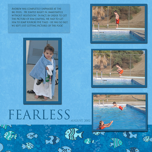
Oh yes! It's like night and day, isn't it! Wow! I'm impressed!
If I had to pick anything apart, it would be too much space between the focal photo and the three supporting photos....space also grabs visual weight and that space is doing so a tad bit.
The focal photo could be larger, but I do see you are cramped for space. Would the journaling work on the border at the bottom so you could just make that focal photo fill that area---don't be afraid to make them big! Bring it's size on up to about the middle of the top supporting photo.
Also, the focal photo seems to need a quick levels adjustment.
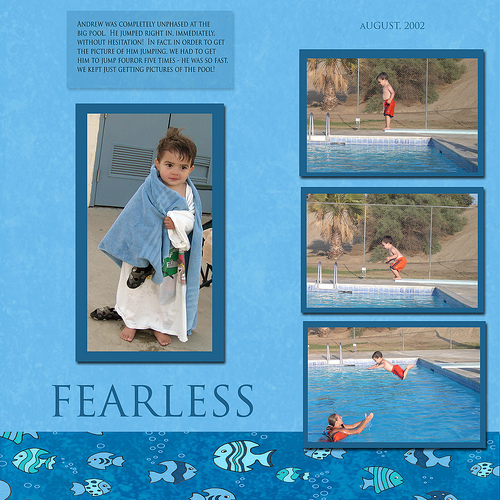
Oh yeah! That photo looks much larger! Yes, the long and thin makes it hard to work with.
I would suggest you observe the amount of space on the right side of the layout between the mats and the edge of the layout and then observe the amount of space on the right side--it is not in balance.
I see that you are trying to balance the amount of space on either side of the title. The balance should be between the elements and the out edges...make them the same.
Maybe this explanation is better.
Observe the background paper and how much of it is on the left edge and how much of it is on the right edge. They should be the same.
The three photos on the right need to be moved toward the center to put more space between them and the right edge so that there is as much space between them and the edge as there is between the left edge and the "F" in the title.
Right now your layout is not balanced as it has more on the right side...heavy to the right.
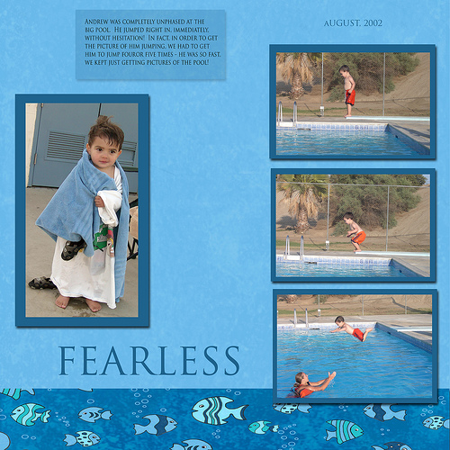
Yes, that is out of balance, but you are getting the idea.
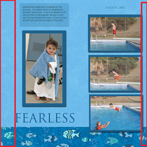
I drew red lines on your layout where the empty space is that should be equal on both sides...I hope this helps you understand better.
You moved the wrong photo. Am I saying left and right wrong? The three photos on the right should be moved toward the center was what I thought I said. Sometimes my fingers type things on their own without me telling them...lol.
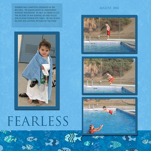
There ya go! Whoo hooo!
Oh....well...the space is not quite equal yet as I look closer....very close though...you might want to tweak it for yourself when you're not it such a hurry to post and share. The space on the left is smaller than the space on the right now.
But I think we've got it....look how far you've come from the first one you did! Isn't it AMAZING! I think so. What a transformation!
I think you put it equal between the two photos and the edges. Since your title sticks out, the left side line-of-things begins with the "F" in the title.
Imagine it as a grouping with a box around it.........this would be the box you are using as a guide for how much space to leave....maybe I can do some more lines.
Picture in your mind imaginary blocks of the elements grouped together. The red lines on the very right and the very left should be equal distance from the edges.
Does this make better sense? Can you see how there is now more space on the right than the left?