These layout suggestion and layout re-do's were done as a part of Course 1, Lesson 8A, on Visual Weight. I invite you to be brave and participate by senidng me a layout. It is how I learned to grow in skills, with others giving me suggestions.
I read your other comment about how hard this was for you. Yes, it is hard! I struggle a LOT with patterns too...that's why you won't see many in my layouts! I just avoid them.
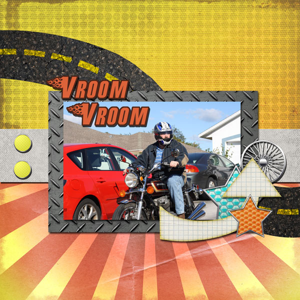
I like the pattern on the top paper. It is subtle enough that it does not detract from the photo and you've got it only taking up less than half the page.
I like that the road leads to the photo, directing the eye. The lines at the bottom also lead the eye to the photo, so that is good placement of both of those elements!
I think that you used patterns well in this layout, but I am a bit undecisive. I'm not sure my eye goes to the photo first. It took me a while of thinking and I think the problem is that the brightness of the papers is EQUAL to that of the photo. So, it isn't really bad at all and you could leave it, but for me, I would probably dull the papers a bit to make the photo pop a little more. I'm undecisive because I cannot tell if this is a personal taste thing or if it is really design principles at work. I just am not good at using bright things myself.
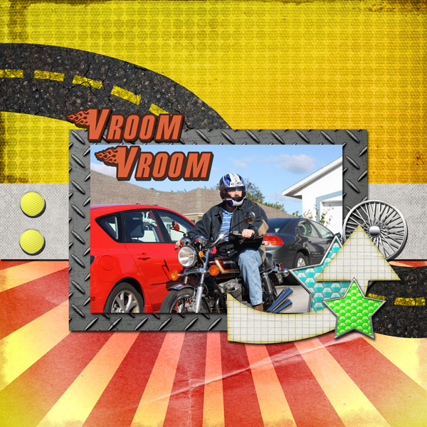
Also, that green star is the only spot of green on the entire layout. Can it be recolored to be the color of the top patterned paper?