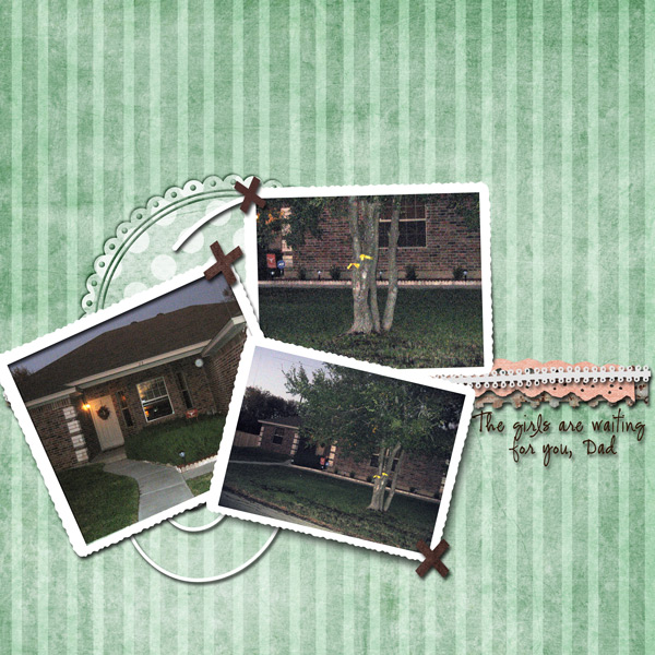
These layout suggestion and layout re-do's were done as a part of Course 1, Lesson 8A, on Visual Weight. I invite you to be brave and participate by senidng me a layout. It is how I learned to grow in skills, with others giving me suggestions.

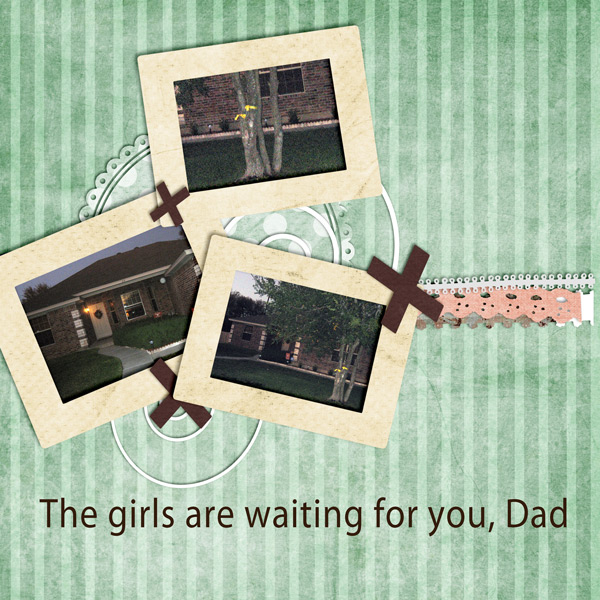
1. contrast - Your photos are dark and the frames and mats are light -- that is good.
2. size - I think you have size problems. The photos are small, yet the size of the frames/mats it total are about equal to the area of the photos. They are too thick. Make the photos larger and the frames/mats thinner. The frames/mats are actually grabbing the most visual weight in this layout.
3. color-pleasing -- not really applicable to any visual weight.
4. shape - The "x's" have value and some of them may be too big also in comparison to the photos.
5. texture - The stripes on the background would be considered texture, but the the appropriate soft color keeps the texture from gaining too much visual weight.
6. isolation - not applicable.
7. value - not applicable.
8. balance - You do have everything grounded, but I think your balance feels off a bit. Your layout is a bit top heavy, or close to center heavy). Try leaving more "white space" at the top - you have more white space at the bottom than the top right now. The title at the bottom is a good thing. If you make it a bit smaller and put it to the right of that circly element, you would have plenty of room to move everything downward. In addition, moving the title there that way would offset everything and apply a form of the rule of thirds.
