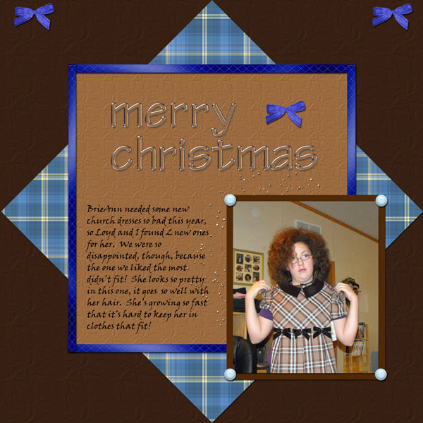
These layout suggestion and layout re-do's were done as a part of Course 1, Lesson 8A, on Visual Weight. I invite you to be brave and participate by senidng me a layout. It is how I learned to grow in skills, with others giving me suggestions.
1. contrast - I can read the text well. The dark brown background is high contrast to make the rest of the layout pop.
2. size - The photo is large enough. It could be a little larger, but it's okay.
3. color - actually, my eye goes straight to that bright blue border, then to the photo. Even while looking at the photo, and especially while trying to read the journaling, my eye keeps being tugged to the bright border. One way to fix this, if you really like the bright blue border, is to make the border thinner, about only 1/4th of what it is now. In addition, you have that bright blue in only two places. It works best to always have a color in at least three places (visual triangle). You could either add another spot of blue or just change the bright blue to match the blue from the plaid.
4. shape - the triangle of the mat actually helps to bring the eye to the center.
5. texture - the plaid would be considered a texture. However, it is not a bright, bold, or overwhelming texture, so it is fine.
6. isolation - not applicable.
7. value - not applicable.
8. balance - although the layout is very balanced, it is not grounded. Everything is just floating in the middle of the page. I would recommend just resizing everything together until the plaid mat touches the edges. Then it would be grounded.
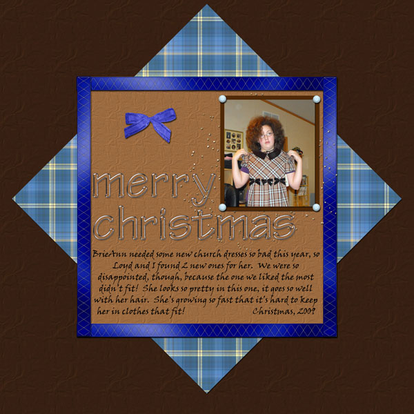
As another suggestion, remember you do not need to stay "fixed" and "squared." I believe you need to learn the greatness of "layering." Layering creates depth. You don't need the photo to be perfectly placed in the corner of the square. There is that common phrase 'think outside the box." This is literally what i am suggesting for you to practice...I repeate literally.
Of course, now everything is a bit top heavy, and bottom heavy layouts are better.....but just take this knowledge and what I wrote above and make a go at it...okay?
Also, I think your drop shadows are a little low.