
These layout suggestion and layout re-do's were done as a part of Course 1, Lesson 8A, on Visual Weight. I invite you to be brave and participate by senidng me a layout. It is how I learned to grow in skills, with others giving me suggestions.
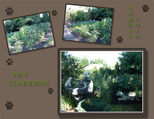
1. contrast - Your photos have both light and dark in them. The dark backgrounds and borders make the white light in the photos pop nicely. I think your best choice is not to stack the borders around your photos, but rather to use the thin white border and then the dark background (or you could use a dark mat). Rather than using so many borders, which looks computer generated, not so realistic to a real page, try using the rectangle marquee tool to make a new layer with an actual mat underneath the photos. This will allow you to customize the size of the mat. A drop shadow on the mat would add to realism too.
With regard to the green text, there is not enough contrast for readability. The problem is that the brown background is a neutral shade (not light or dark) and so it is hard to find a good color to go with it until you would use black or white or a really dark brown (like the footprints have a nice contrast). Or you could use the eyedropper tool to get a really dark green from the photos.
2. size - The size of your photos is good to bring them visual weight.
3. color - Browns are a neutral color and always safe. Just like whites and blacks.
4. shape - not applicable.
5. texture - this would be the distracting pattern on the second layout.
6. isolation - not applicable.
7. value - not applicable.
8. balance - you have the larger focal photo on the bottom and this is good to make it bottom weighter. However, you could leave a little more empty space at the top to help push things down.
There is a lesson I continue to want to record and that is on "grounding." Grounding is having everything touching something that touches something touching an edge. It can only be one edge, but as long as there is a chain of "touching" to that edge, it grounds everything. Right now, your photos and titles and whatnot are just floating on the page.
The easiest way to ground is to make mats, as I suggested above. Have the mat touch an edge. Have mats go under other mats. Do not be afraid to move layers so that they are partially over or under another layer. I think once you begin to utilize "layers" and "stacking" you will see a big difference in your layouts. You are doing like most (even me!) and trying to lay things out like you would on paper where nothing stacks. That's the wonderful thing about layers. It brings depth to a layout when you stack things by having some layers go under or over others.
The easiest mat to ground things is simple a layer of color at the bottom from the right to the left.
Try making your mats a little more width to the right or the left of the photo and putting the title there.
I'll 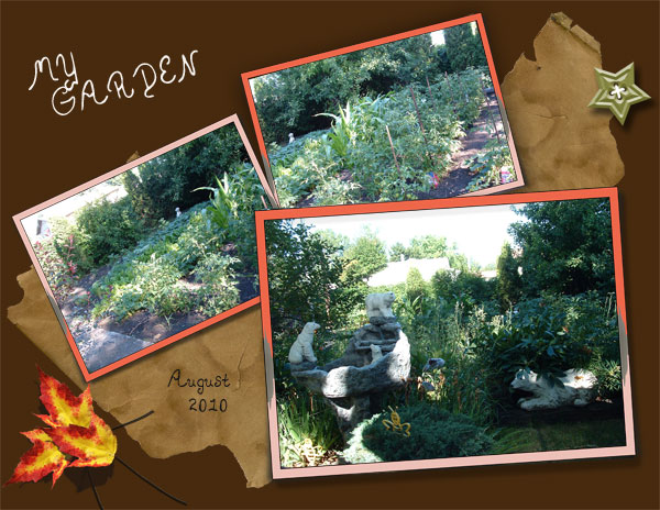 leave you with all this as I know it's a lot to soak in! I look forward to seeing what you can do now!