My Corner Online

These layout suggestion and layout re-do's were done as a part of Course 1, Lesson 8A, on Visual Weight. I invite you to be brave and participate by senidng me a layout. It is how I learned to grow in skills, with others giving me suggestions.
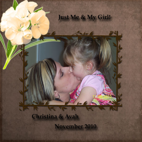
Here is a layout I did over a year ago. The next is the same picture with new layout trying to utilize the weight and grounding tips I never knew existed until now.
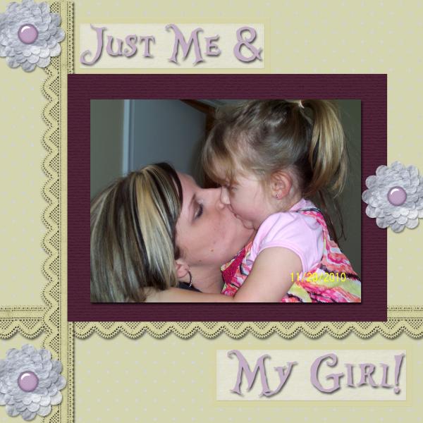
1. contrast - The dark purple mat is good contrast for the photo. I can read the text good.
2. size - The photo is certainly larger than anything else, so that is the main visual weight principal working here. On the first one, that flower was so large, I'm sure you see now why that was not a good choice and it is good that you changed it.
3. color - Most of the color is neutral. You did use the flowers in a visual triangle of three which spreads that color around, as well as with the title.
4. shape - not applicable.
5. texture - not applicable.
6. isolation - not applicable.
7. value - not applicable.
8. balance - I think it is grounded well... you have that down now! I think it might be a little top heavy. You could drop down the top title so it rests right on top of the purple mat and make it smaller text. It is okay for the title to have two different sizes of text.
The one other thing I see is that the purple mat on top of the ribbon is not realistic. If you were paper scrapbooking, it would be hard to put glue on lace. Just drag the paper mat and photo layers below the lace ribbon and it will be fine. Letting the lace rest on the mat would be nice.
You sure have learned a lot and come far since you did that first layout. Good for you!
