My Corner Online

These layout suggestion and layout re-do's were done as a part of Course 1, Lesson 8A, on Visual Weight. I invite you to be brave and participate by senidng me a layout. It is how I learned to grow in skills, with others giving me suggestions.

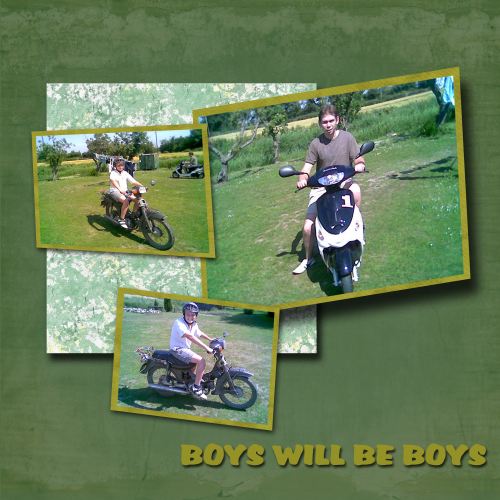
The rule of thirds works with one larger photo and two smaller supporting photos photos (3 photos). I see you had fun with the skewing! It reminds me of when I first played with it and how much fun it was to be creative.
I want to encourage you to journal; otherwise these photos are no different than some photos sitting in a box that someone will pick up 30 years for now and wonder about.
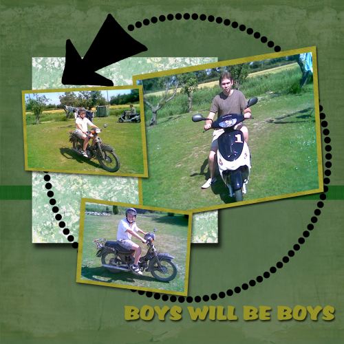
Everything is out in the middle of the page just floating. You should add something so that it touches the edges to ground everything.
Also, for realism, the drop shadow on the bottom paper mat is to large. Maybe go back and watch the special video I have in course one on drop shadows to understand them better.
Anything on a bottom of a stack, closer to the paper, will have a smaller drop shadow. As you want to give the illusion that it is getting higher off the page, the layers above might have slightly larger drop shadows.
I would love to see your re-do! It's fun watching people learn and grow, and this is how I learned, people told me the same things! This very well could have been one of my layouts when I first started.
