My Corner Online

These layout suggestion and layout re-do's were done as a part of Course 1, Lesson 8A, on Visual Weight. I invite you to be brave and participate by senidng me a layout. It is how I learned to grow in skills, with others giving me suggestions.
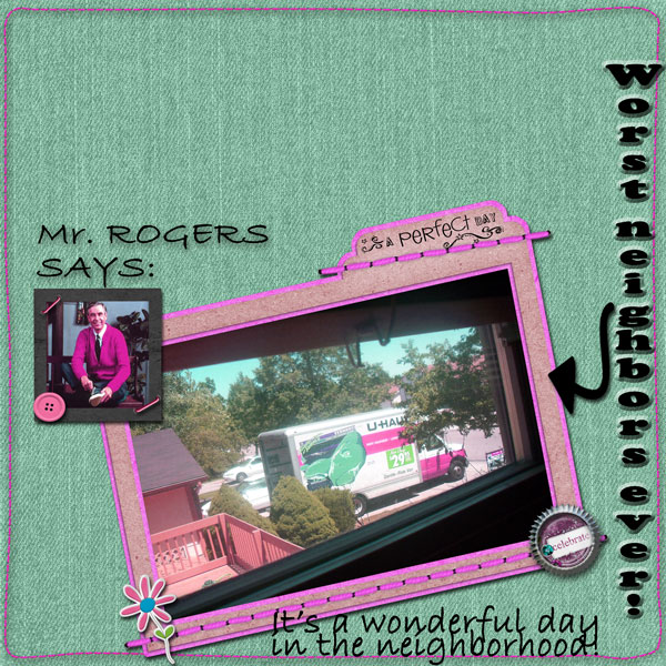
1. contrast - I can read your text fine. There really isn't much contrast going on for the photos though.
2. size - size is helping your focal photo, but the title is also so large that it has too much focal weight.
3. color - The pink is cute, but unfortunately, I see the pink title and then my eye goes to all of the pink first before it lands on the photo. Even with the photo as large as it is, my eye really struggles to get there. Bright colors are very hard to work with to keep your photo the focal point unless it is your photo that contains those bright colors. My eye goes from the title, to the pink border on the right, to the pink on the frame, and then finally makes it way to the photo.
4. shape - not really applicable, but the curves on the border might be pulling some weight.
5. texture - not applicable.
6. isolation - not applicable.
7. value - The flower has value. Making it smaller might help. The frame has some value to it also. Frames can be hard to work with, especially if they are too thick or too bright because the eye will go to the frame and not to the photo. I am wondering if you changed the pink to the red on the side of the truck if that would keep the frame from fighting for visual weight and instead help bring the eye to the photo. I always suggest starting your scrapping with the photos and the mats or frames around them and then working your way out. Make sure the mats and frames bring a contrasting color (per tutorial) to make the photo pop. In this case, a matching color might work too. I'm thinking I wouldn't like red and green for this layout though (Christmas colors), so what if you make the stuff another neutral color...maybe even black...you'd have to really play.
8. balance - This layout is too balanced. The blank space is disconnected. Observe where your blank space is. Move things down a bit to make it all bottom weighted and leave your blank space all together at the top. Everything doesn't have to be right on the top of the page. Also, things are not quite grounded, but almost! To ground everything, everything must touch something that touches at least one edge. I see the flower touches an edge and my eye does connect the frame to the flower, but on the other side of the frame, it looses connection. Just a simple thing as allowing the stitching of the frame to go onto the border would finish off the grounding. Of course, you can always use matting to connect things. Your photo at the top left is just floating on the page, as well as your title.