My Corner Online

These layout suggestion and layout re-do's were done as a part of Course 1, Lesson 8A, on Visual Weight. I invite you to be brave and participate by senidng me a layout. It is how I learned to grow in skills, with others giving me suggestions.
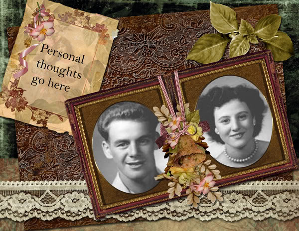
1. contrast - you can never go wrong with black and white photos on a dark brown background!
2. size - my eyes do go to the photos first, so they must be large enough.
3. color - no problems here.
4. shape - the oval shape in the frame does help to bring the eye to the photos first
5. texture - you do have some texture on the background mat, but it's visual weight is okay.
6. isolation - not applicable.
7. value - the cluster in the frame has value, but it doesn't grab visual weight away from the photos, so that is good; the journal mat is also grabbing some visual weight because of value and color, but my eye goes there second, so that is okay.
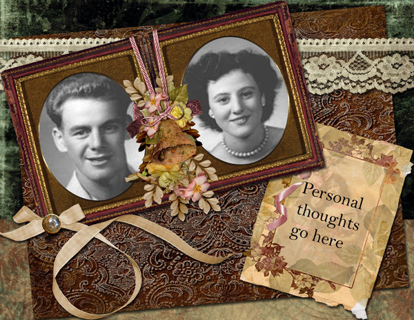
8. balance - If I were to have one suggest, it would be with regard to balance. The frame of the photos is very heavy and you have it at the top, along with the nice lace, so the entire layout is very top heavy. Flipping everything would help. Bring the lace to the bottom and set the frame/photos to rest on it, then move the journaling at up....may take some tweaking and turning of things to get it to look just right. I'm not sure where you would work in that pretty ribbon if you did that.
It's not bad the way it is, and you could leave it, but that is my only suggestion. Great work!