SET 1
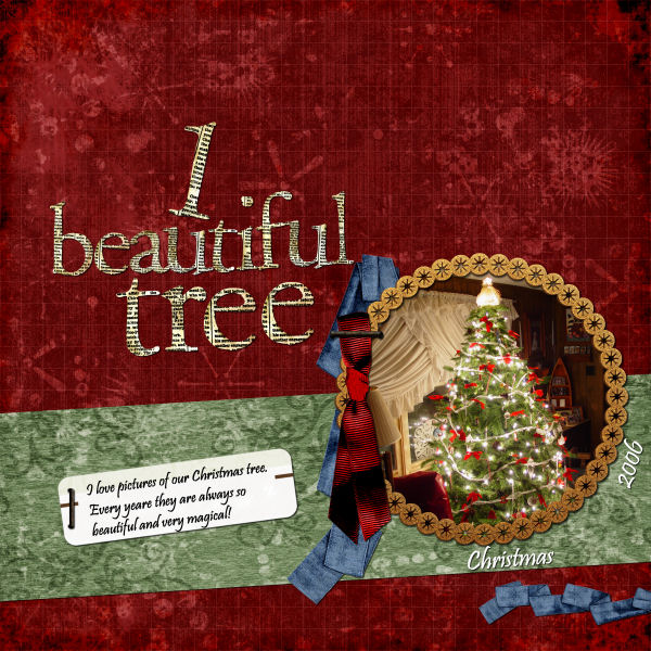
8. Scraplift this!
Posted at DST by Makabe.
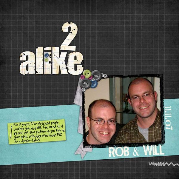
There is so much that I like about this layout.
First, it is simple, with no big patterns to distract the eye.
The title is unique and I love the number used as a word. The title is large and yet it doesn't detract from the focus being on the photo. That is hard to do.
She included some great journaling -a must!- and yet was able to keep a lot of valuable "white space." (we all know white space is not always white, right?)
That stitching is placed just right to give some bottom weight to the layout and draw your eye downward toward the photo.
The contrast between photo and papers is just right to make the photo pop.
Anything else you see?
Anyone want to scraplift with me?
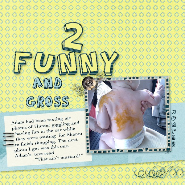
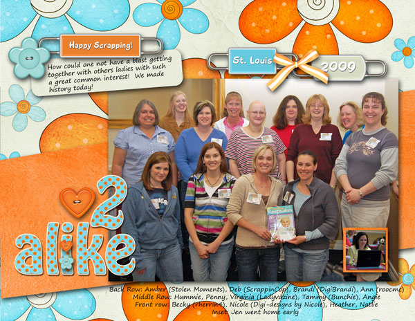
Here is my layout.
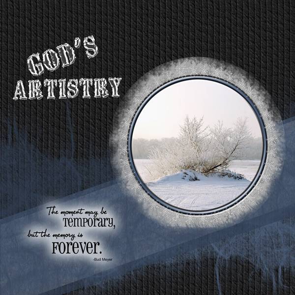
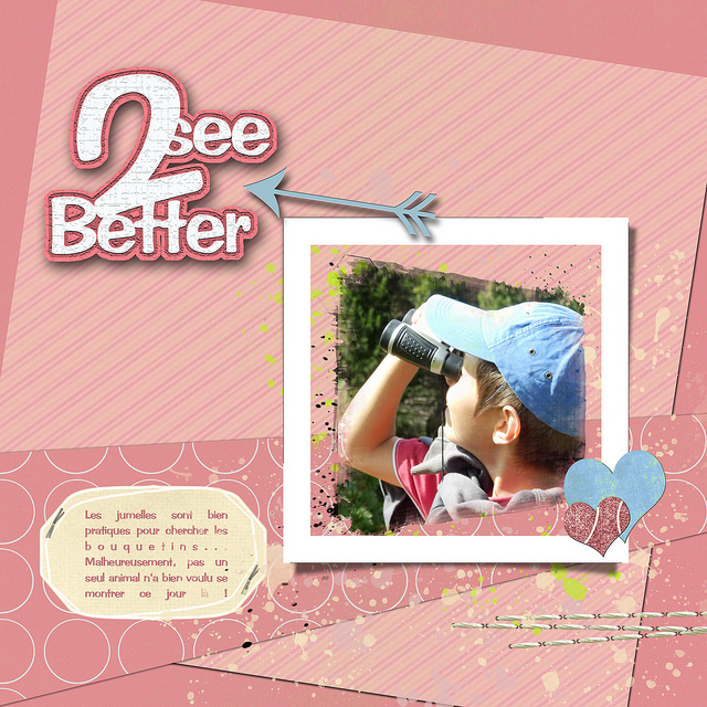
Here are your digital scrapbooking layouts!