The Fun Extras - Set One
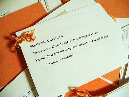
10. Emotions and Color (Link to Comment)
If you do not make a new layout for this lesson, at least look through your layouts to see if you have any to share that to invoke emotion in color and share them with your thoughts.
Read my tutorial on Emotions and Color.
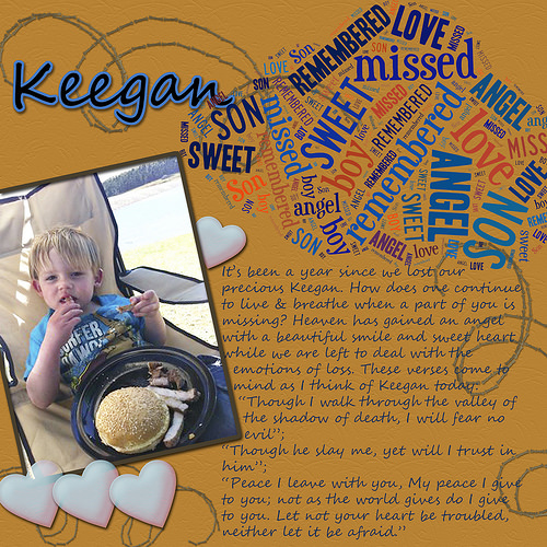
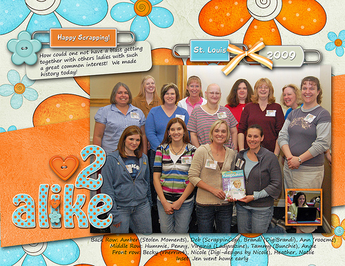
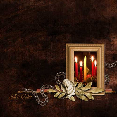
I printed out this presentation and made a booklet for each scrapper as a hands-on reference tool at the St. Louis Digi-Gathering.
Melissa (Scrappin My Buns Off) made this awesome kit for those attending! I believe she was the only one to make something especially for the gathering with a St. Louis theme! I loved using it!
I did not get a chance to do the challenge, so I took the opportunity to do it with the group photo using Melissa's kit which, to my surprise, was the perfect color! The ladies attending will recall that I mentioned that I utilized the orange and teal colors for room decorations to convey the emotions of joyfullness, playfullness, socialability, happiness, and creativity. When I opened up Melissa's kit I was pleasantly surprised to see the same colors! It was perfect to convey the same emotions in my layout.
Utilizing the tutorial on Emotions and Color in your own layout as the ladies at the gathering did as a challenge. Choose your photos and decide what emotions you want to convey. Thereafter, choose the color that conveys those emotions and scrap!
Here is another layout I made.
Some of your comments and layouts!
Yes, I have always understood the relationship between color and emotions. In my more "darker" pages, I use natural/muted tones. In my happier/celebratory pages, I use brighter colors. I think a good idea for a challenge would be to scrap the opposite emotion. Hmmmm... I wonder...
---
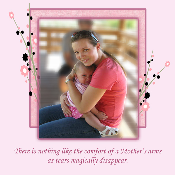
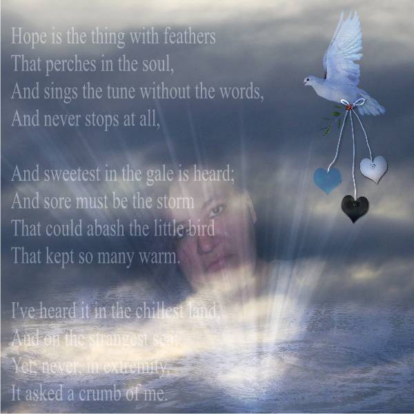
I think subconsciously I must be thinking of emotions and color when I am studying a photo. Not only do I choose or try to use colors that compliment the layout, but how the final color selections make me feel. As seen in the layout below of my grand-daughter-in-law and my great-granddaughter the color of pink and the coral go along with the tutorial of what pink symbolizes. This layout is sweet, calming, soft, feminine, security all the things that the baby needed from her mommy. Every time that I look at this layout, it just pulls at my heart not only for its beauty, but the peace that I know that only a mother can give to a child (not to take away anything from fathers, as they have their own special comforting they give), but hopefully you know what I mean. I hope to be more conscious of this new way of looking at things. Thanks for the fantastic tip.
---
I don't think I put a lot of consideration into color.
I can see where it would make a difference after looking at your tutorial.
I guess it is interesting that I chose green for this layout of my husband and myself since green indicates peace, love, hope, harmony, etc.

---
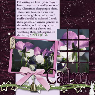
A couple of my layouts that I hope convey the feeling behind the photo! The first I was aiming for a calm feel, the second, despite the title, LOL, I think I was a bit chuffed to actually be using a photo of myself for a change, LOL, and that reflected in the patterns and colours used!! Its not a conscious thing though, it just seems to happen!
I seem to have done a lot of calm-feeling pages, LOL!!
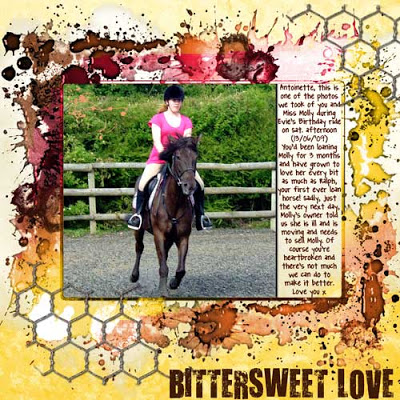
This one was where we had just found out DD1's loan horse was being sold the first time. I think this one shows how upset we all were feeling!!
---
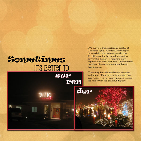
Love the booklet that you made! I don't usually try to convey an emotion while scrapping (except love). But sometimes I don't pick a color from the photo(s) I'm using. So how do I pick a color? I pick a color I like - usually something peaceful or something neutral to make the photos pop. This layout is an exception. I picked the orange tinged background to add vibrancy to the layout and a bokeh backdrop to add a fun feeling. I love the idea of thinking of the emotion you want to convey - thanks, Hummie!
---
I am one of those scrappers who usually just bases my colors on the photos, what coordinates or makes things pop off the page. It's the one anal characteristic I have when it comes to scrappin', it's what gets my thoughts organized...picking out a color from a photograph. So I guess I don't usually go w/just emotions w/color. But this LO is one that while the colors matched a little, I picked the flowery fun paper b/c of the picture and what was represented.
---
Looking back at the LO's in my gallery, I noticed that unless I specifically chose backgrounds to match colors in photos (or the complimentary color), I tended to choose colors in the green family which is for balance and peace. That was very interesting to me. I did that unintentionally, but will now pay more attention to the emotions I want to convey. This was very goo food for thought. Thank you, Hummie.
---
I like my softer, neutral colors. On occasion I drift from that, but I always come back to it. I'm really drawn to brown as well. Brown is a neutral color. For me, it is peaceful. In my life, I could choose to choose sides on a lot of things, but I prefer to keep the peace. I am a neutral person, up until a point where someone treads on something that I believe in. When that happens, I am gung ho- but for the most part, I really find the neutral color of shades of brown very peaceful and tranquil- which is one of the main reasons I used brown as a major color in my room redecoration. I also chose blue for my room, because to me, blue is another color of tranquility and relaxation.
---
I can't say that I've ever conciously thought about color expressing emotion in my layouts, but when I think about it, I realize that I've maybe subconciously done just that. Why else would I use bright, happy colors for fun, active layouts and muted colors for heritage or peaceful layouts? I'll have to print the tut and reference it for some layouts. Thanks for making me think.
---
Yes I do believe color expresses emotion. I love the green, browns, and blues. My son loves red has since he was 9-10 he is now 23. Every thing he wears is red. He has never worn bule jeans!! Do you know how hard it is to just buy red clothes LOL
---
I love the idea that color expresses emotion. I never really thought about it, but it definitely does.
---
Thanks for the tutorial--have to think about color choices a lot more now. Your layout is great!
---
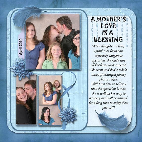
Even with my Interior Design background, I still usually choose my colors from my photos, but a lot of times it comes out ok anyway. For example in this one, I wanted to pick up the blues in the photos, yet your description of blue (peace, tranquility, calmness) are very prevalent in this layout.
---
Here's Mine Layout using the tutorial, I hope the colors I chose shows the emotion i was going for but I will wait for comments to see.. LOL
---
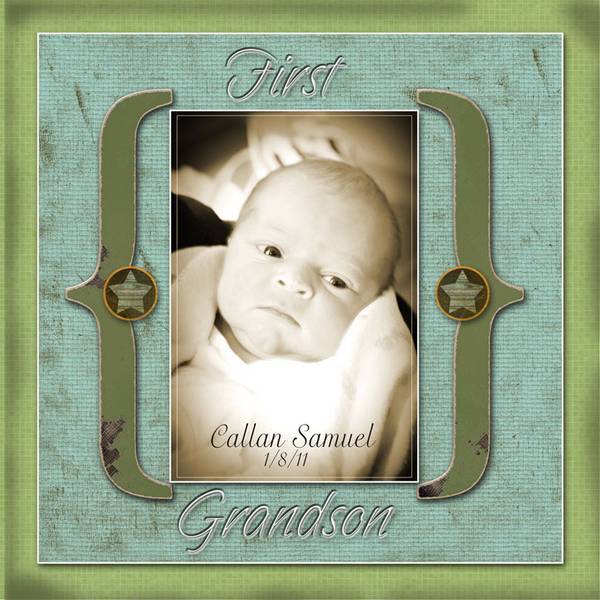
I really enjoyed this lesson. I do think that colors make you feel certain emotions. I have a friend that has a red wall in her kitchen and every time I see that wall it makes me feel like I want to scream! It shouts out at me and makes me feel antsy!!! No red walls for me!!! This is my new Grandson. He is scrumptious!!!
---
Hummie your picture looks great ! I have never thought of emotion and colors. Just choose what I thought looked best.It looks interesting.
---
Very interesting tutorial. I am going ot read some more on the color wheel. I use tons of bright colors when I quilt. I never related that to emotions; feelings. Thanks for the information.
---
Good info, I'll put it to use next week.
---
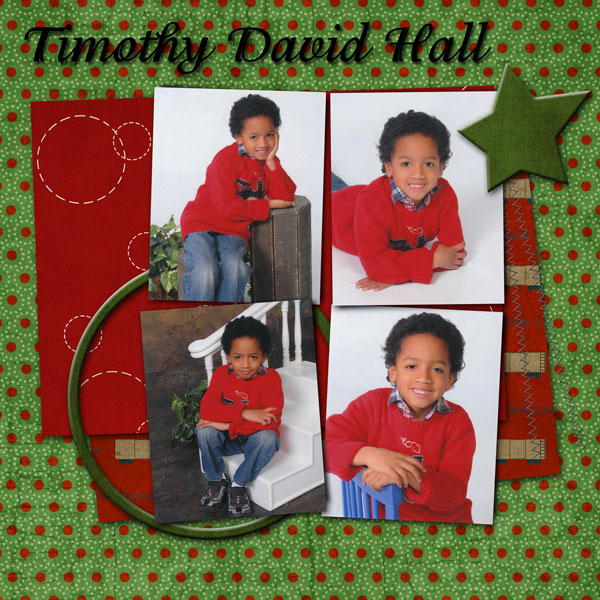
Here's mine! I chose red because of the excitement we felt at getting professional pictures done for the first time. The green was for the love and pride I felt while watching pictures being taken.
---
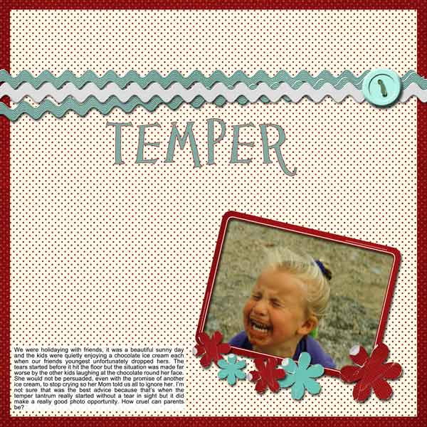
I have never given thought to using a specific colour on a lo to portray an emotion. I have looked through my old lo's and on the whole tend to go for soft muted colours so here is a change for me. I chose red to portray the temper tantrum and anger the child was feeling but added turquoise accents, which is opposite red on the colour wheel, to soften the lo a little as the red was so strong.
---
I have downloaded the tutorial, read it through once, and it is now part of my arsenal! Thank you, Hummie!
---
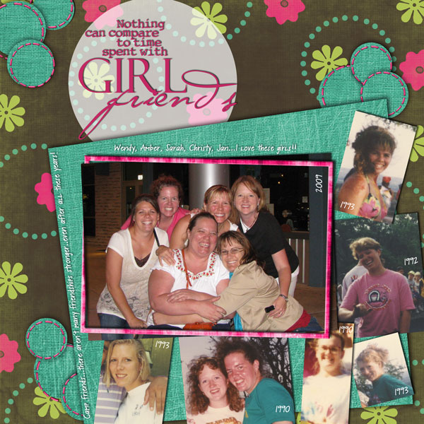
Looking back through my LOs I realized that i choose a lot of papers based on emotional response, but I don't think I do it conciously. Here's one I did a few months ago of my aunt--I think the papers were chosen based on how I feel about my aunt as much as the feelings the photo invoked.
---
When I am doing layouts about my kids, those I love, I mostly use brown, blues, and pinks. I think those three colors for the most part do show the emotions that I am feeling and intend in those LO's. But it is not a conscious thing for me.
---
I don't think very many people realize how much color affects our lives. I think we do let our emotions chose our colors much more than we think we do. In my opinion, our predominate color choices also reflect our personalities. Thanks for laying this information out in such an easy to understand way. I also like how you included the nagatives. Very helpful.
---
Umm Interesting.. I don't think I use color in my layouts to convey 'feelings' or 'emotions' in the layouts. I have never considered this... I think I chose my colors partly on the photo and partly by colors that make ME feel good. I have printed this out and its in my book. I am going to do what I normally do, but see what the sheets say about it. I think I will trawl back through some of my layouts and consider what I did referencing the printout. I don't think I scrap anything apart from happy memories (apart from a couple of old heritage photos).
---
That was a great tutorial. I tend to be very aware of color and what it conveys as far as emotions and especially the overall sense that a viewer takes away from looking at one of my layouts.
---
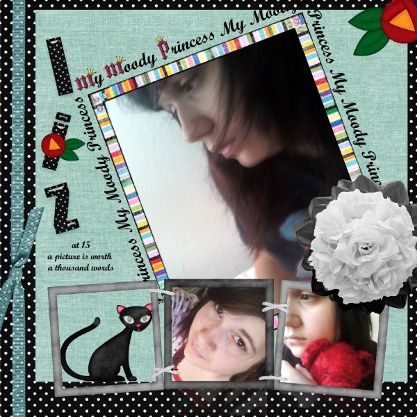
I love color but I usually fly by the seat of my pants when choosing colors. They usually end up conveying the emotion I am thinking of. This one I created for a challenge I participated in to first learn to digital scrap and it turned to still be one of my most favorites. It is called "My moody princess" about my teenage daughter and I love the stripes in the frame with lots of "moody" colors. She certainly is a combination of many moods.
---
I have my go-to colors, browns, blues, greens, but I really never thought about the emotions colors evoke. Thank you for the tutorial. I'm going to read through it again.
---
There was a lot of emotions with this one.....I usually chose something from the browns when I'm in this mood, not sure why. Maybe the earthiness of it? Or the fact that being lost in thought is often referred to as a 'brown study'.
---
Thanks for the info Hummie! I pick colors based on my current mood (so emotion) and just started picking out colors that are in the pictures since watching your tutorials. It definitely gives me another way to look at things when trying to decide on what colors to use. Thanks!
---
I was just using a kit as required because I was on a creative team. However, after reading the tutorial I can see how the color purple applies in these pictures. Georgia was dressing creatively for a party she was going to with her mom.
---
When I started out creating, I used PSP (7 yrs.ago) & always used color to reflect the emotion I wanted get out. Now that I'm creating LO's I tend to find scraps that fit with my photo's. To me, orange is very cheerful & you can see that in your layout. Beautiful scrap & LO
---
Interesting summary about colors. I use a variety of colors when I scrap, but each layout tends to be focussed its own combination. I think of myself as a "muted" scrapbooker, but then I looked over my gallery here, and saw that I am actually all over the place in color choices, depending on the mood of the photos and the subject. So I guess I am using color properly!! I have a bright one with my energetic grandson featured. He never stops and exudes energy from dawn to dusk. So unconsciously I chose energetic pallette. I visited a Japanese Garden in Vancouver, BC, while passing the time until it was time to board a cruise ship. Tranquil subject, tranquil picture, tranquil color scheme. It just happens. I also did a lot of heritage layouts in the past and always stuck with browns and beiges. Which is why I consider my style muted, I guess. I remember periodically having to bust out of that mode at the time and do a bright page.
---
I love color and usually make very colorful layouts, but never spent a lot of time thinking about colors. Thanks for sharing the tutorial, I will save it for future reference. I want to do a total blue page- peace tranquillity calmness..
thanks!
---
I chose the color yellow to scrap a photo of my grandkids looking for bees in a flower pot. Yellow denotes youthfulness, happiness and energy.
---
I printed out the tut on colors.... I decided to look back on some of my Lo and to my surprise the colors match emotions!!! what a great new way to scrap.....
---
I like the way you think of colors-a better out look to them for sure.
---
Although I am fairly new to making layouts, I don't think emotion plays a part in my choice of colour. When I look through my gallery I notice that my layouts tend to be muted, using mainly soft shades of brown, green, pink and blue. With the exception of one layout. There I deliberately put myself out of my comfort zone as I detest the colour orange, but thought I would try something different.
---
Colors and emotions are the basis in painting, and I generally pay attention to this in my layouts.
---
Colours used to convey emotion is quite sobering. I used orange for the emotion "tender" and blue for "heaviness & melancholy." Thoughts of my great nephew bring a mixture of both emotions and I was pleased to see orange come up when I selected the blue from his shirt and then clicked on Ctrl I.