Introduction
Lessons 1 & 2
Lessons 3 & 4
Lesson 5
Lessons 6A & 6B
Lesson 6C
Lesson 6D
Lesson 6E
Lesson 6F
Lesson 6G
Lesson 6H
Lesson 6I
Lesson 6J
Lesson 6K
Lesson 6L
Lesson 7A
Lesson 7B
Lesson 8A
Lesson 8B
Lesson 8C
Lesson 8D
Additional Videos
What's Next?
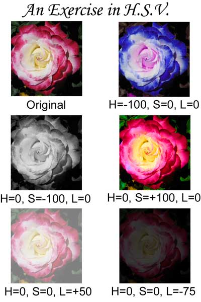
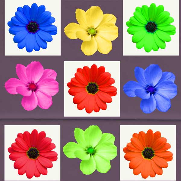
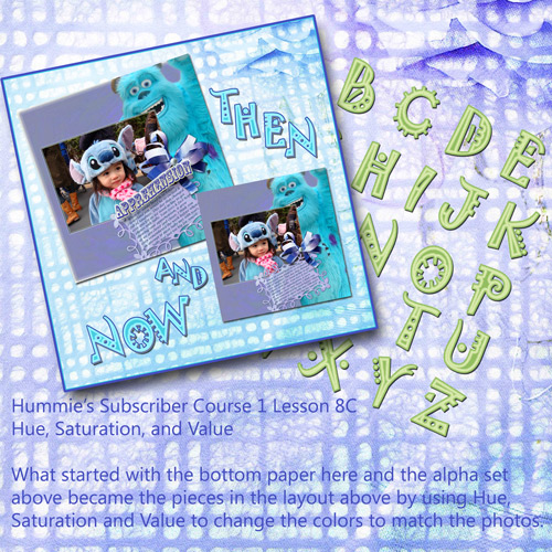
Lesson 8C - Hue, Saturation, Value
(pdf) (link to comment)
I learned so much just writing this tutorial! This tutorial is very detailed and can be difficult to understand, so be sure to take your time with it and ask questions if you do not understand.
This tutorial will help you not only understand the Color Picker, but also to understand all those things your elementary school teacher taught you! Yes, it will all come back and finally make sense. You will be able to finally apply those art lessons from way back when!
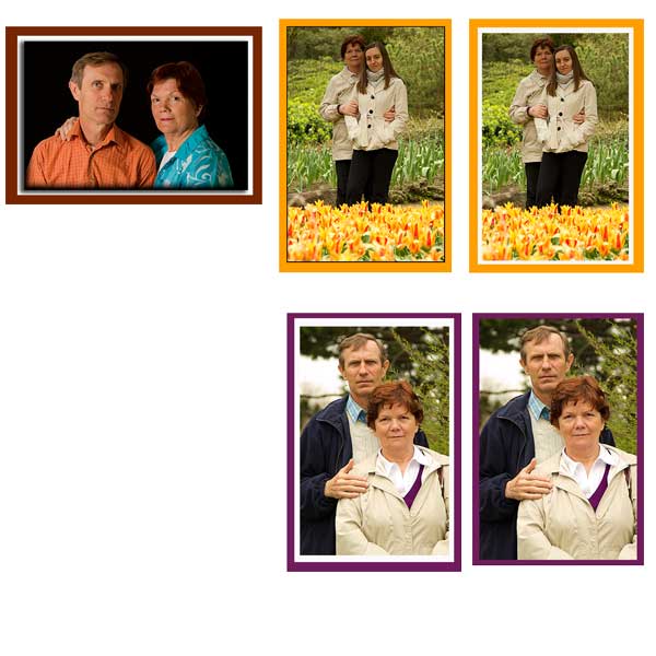
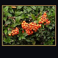
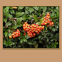
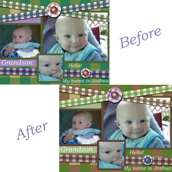
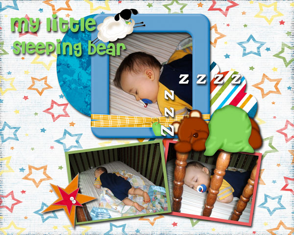
 When you are done reading the tutorial and watching the video, create a layout to share. Use the eyedropper tool to grab a color from your photos. Change the "value" of the color and use that color as your frame. Remember the visual weight principle of "contrast?" Be sure to change the value enough to create enough contrast to make your photo pop.
BIT OF INSPIRATION
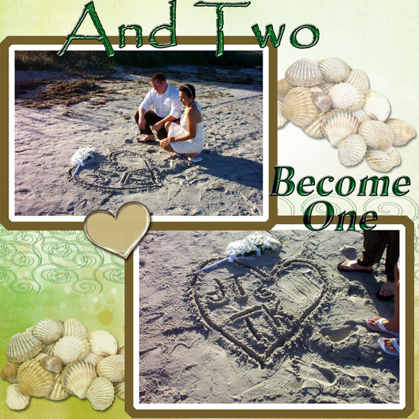
What greater thing is there for two human souls that to feel that
they are joined... to strengthen each other... to be at one with
each other in silent unspeakable memories.
George Eliot
WARM FUZZIES
This is a fabulous resource and a great read. Thank you for all your time and effort into making a great website. 10/9/07
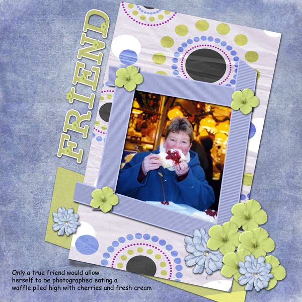
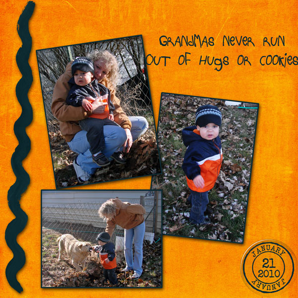
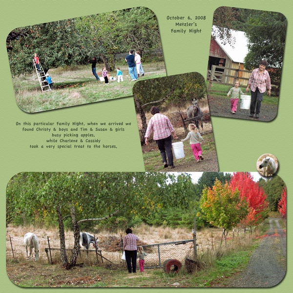
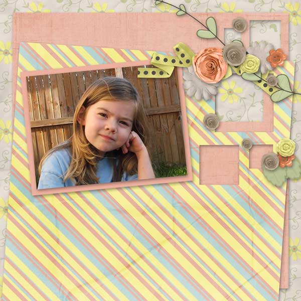
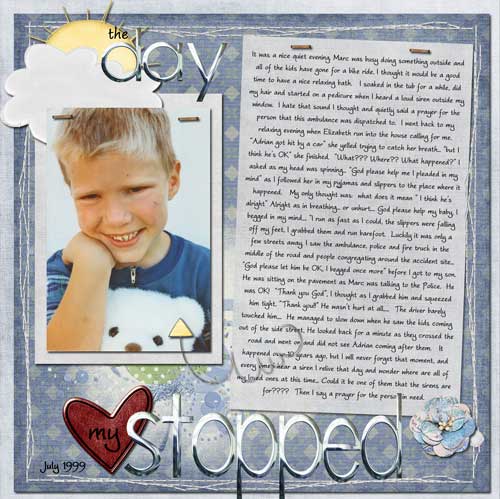
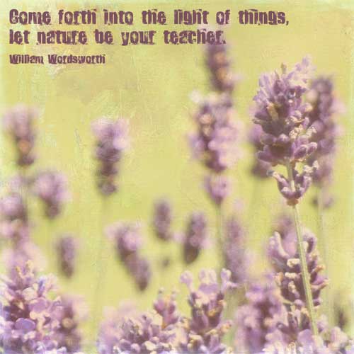
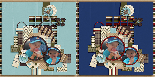
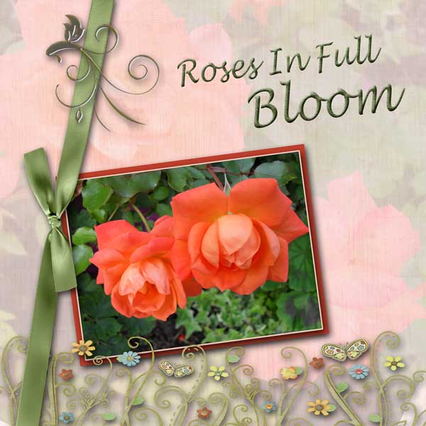
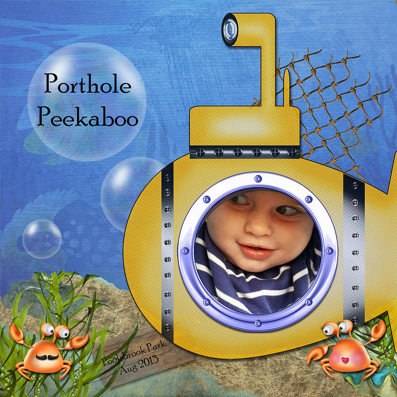
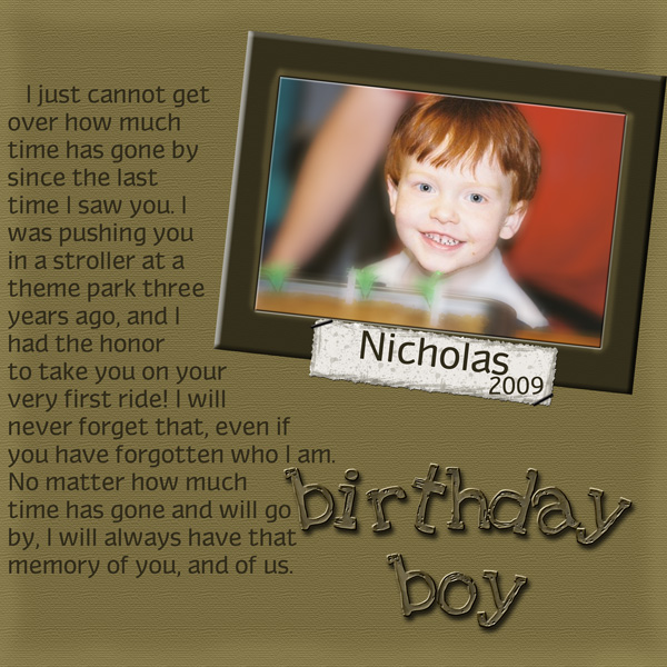
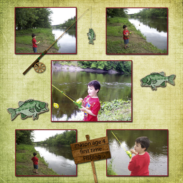
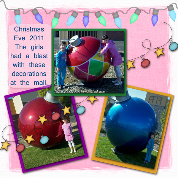
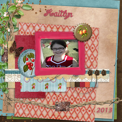
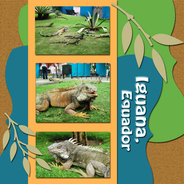
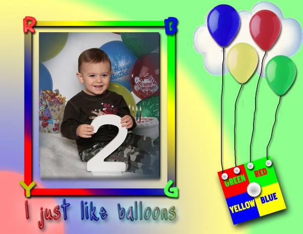
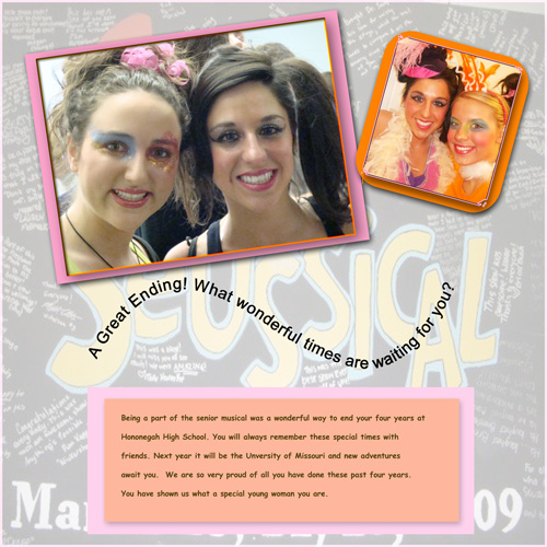
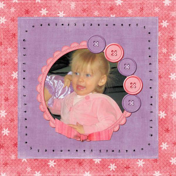
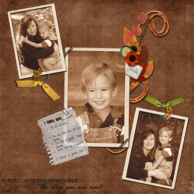
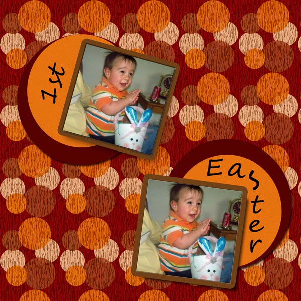
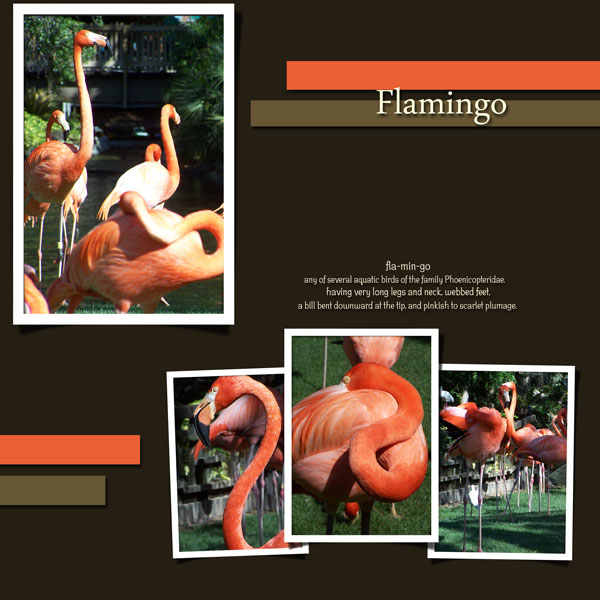
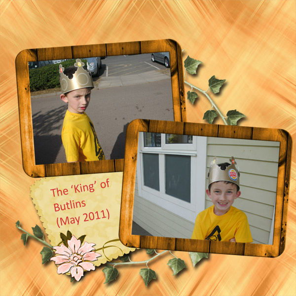
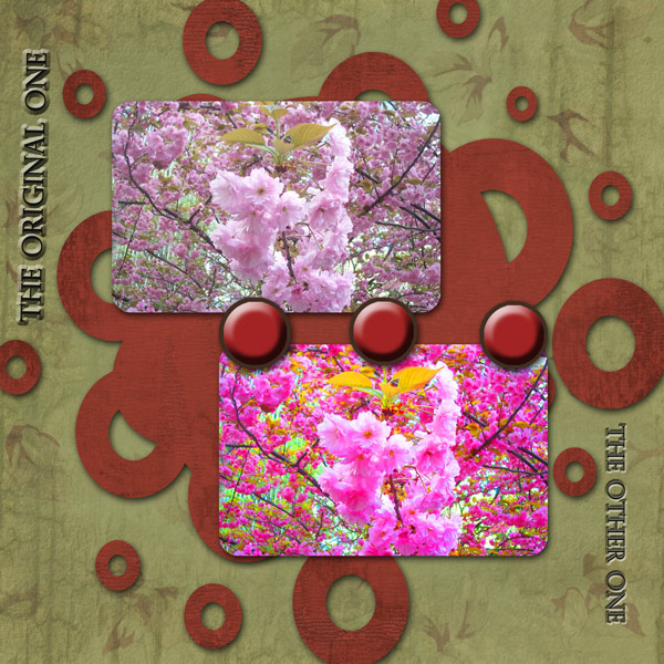
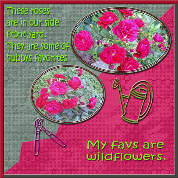
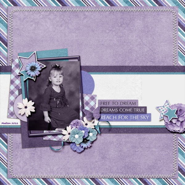
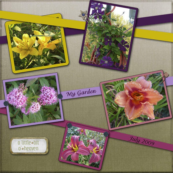
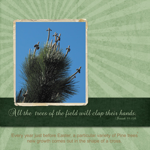
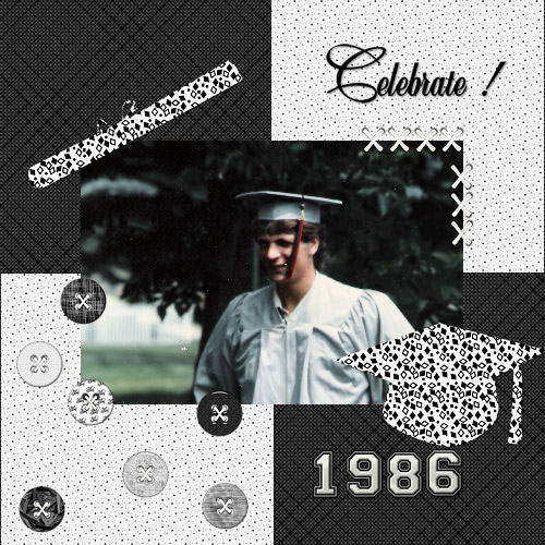
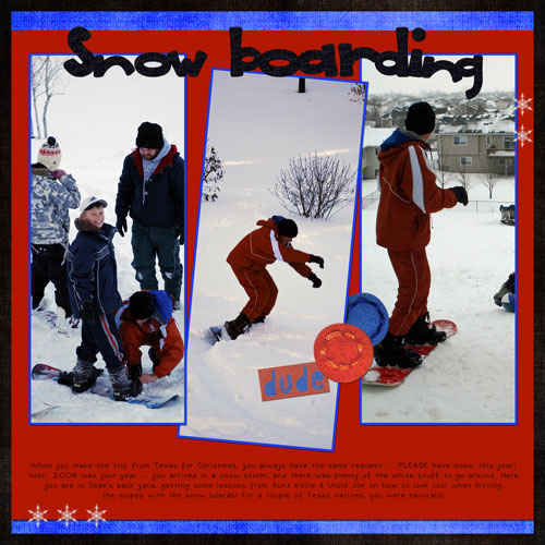
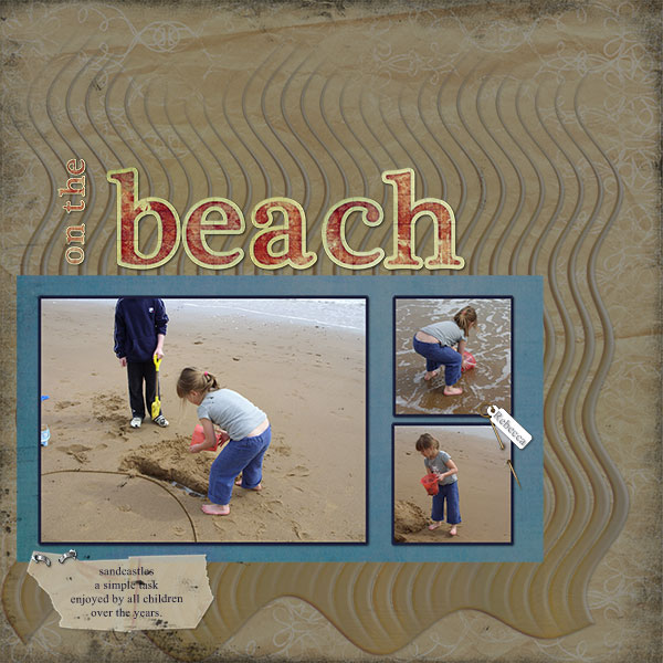
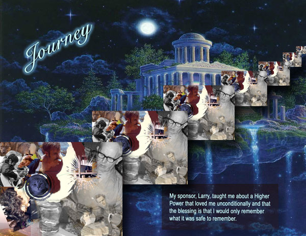
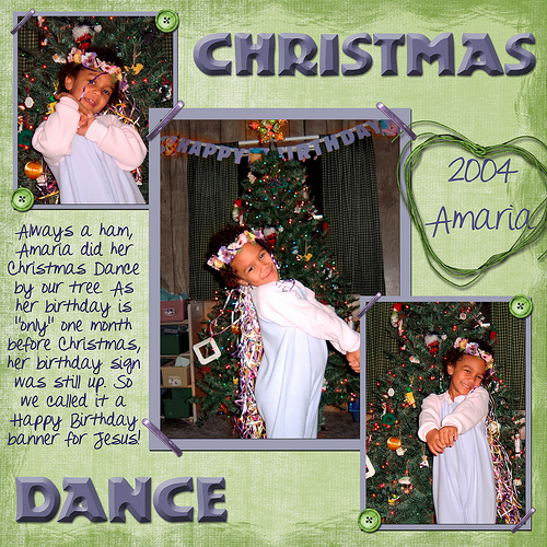
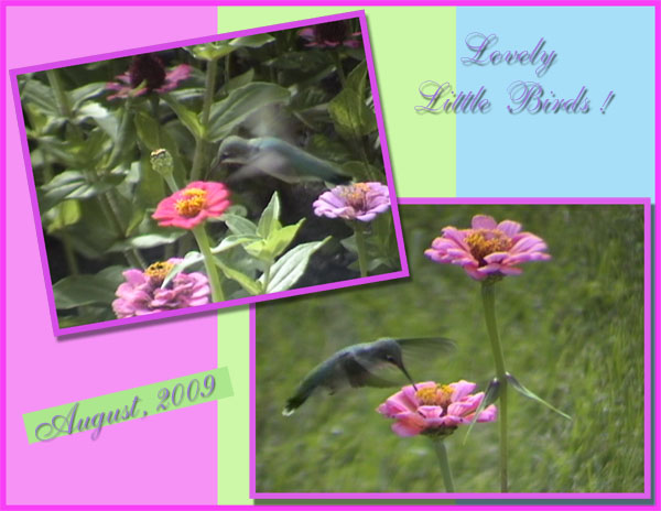
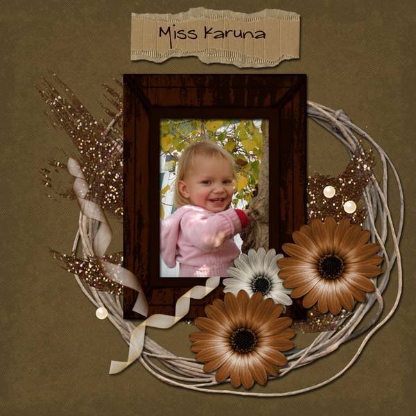
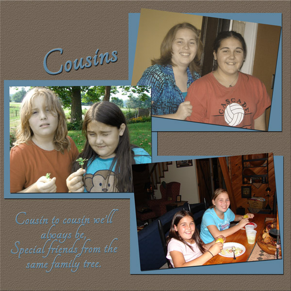
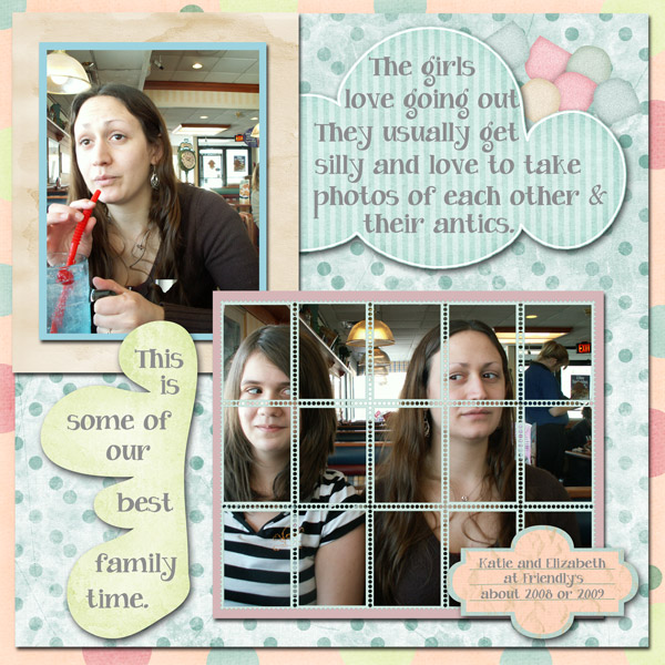
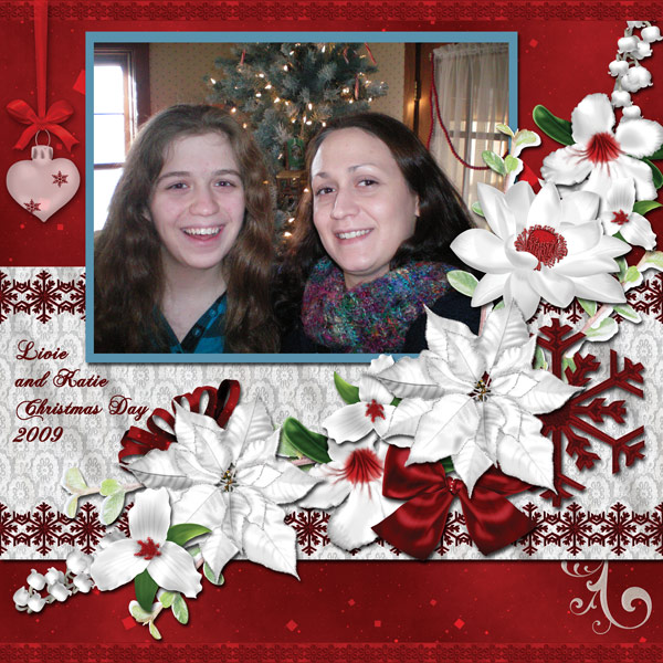
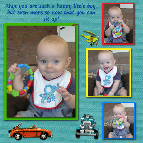
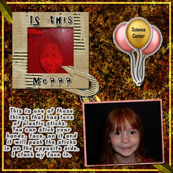
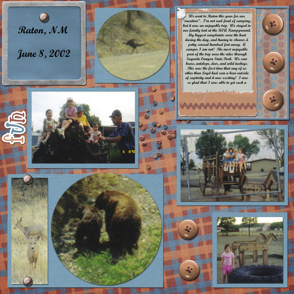
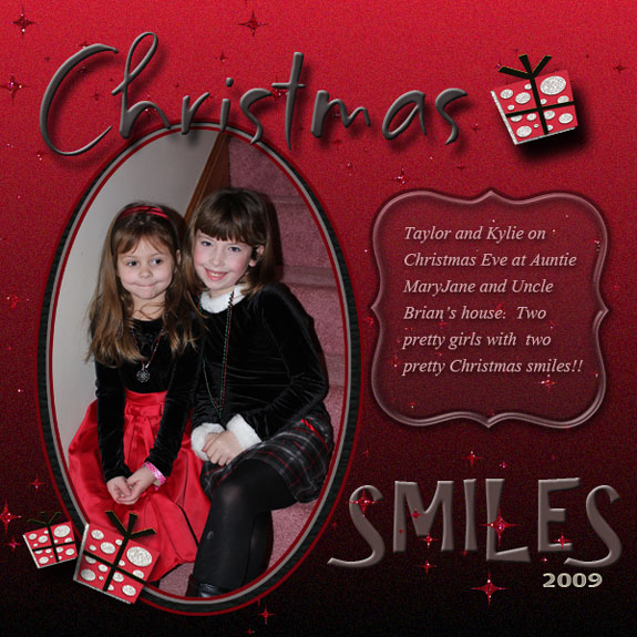
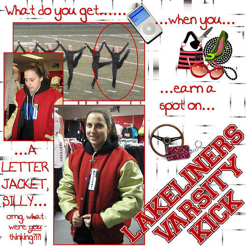
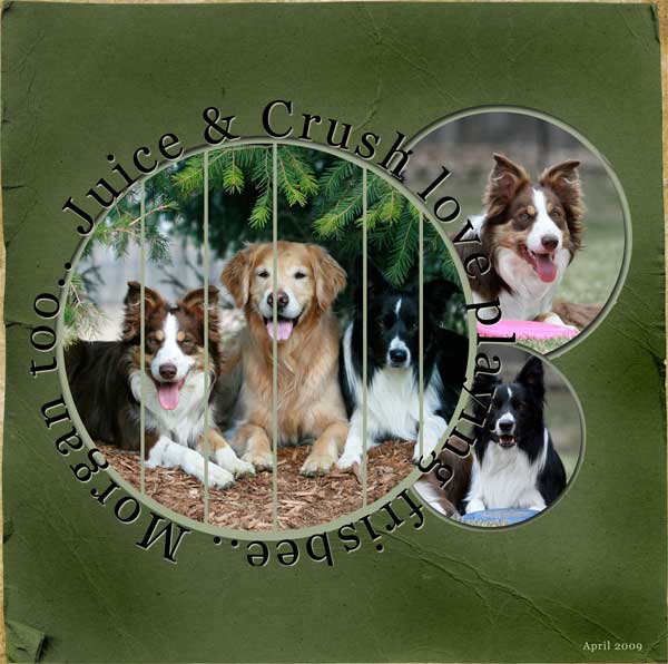
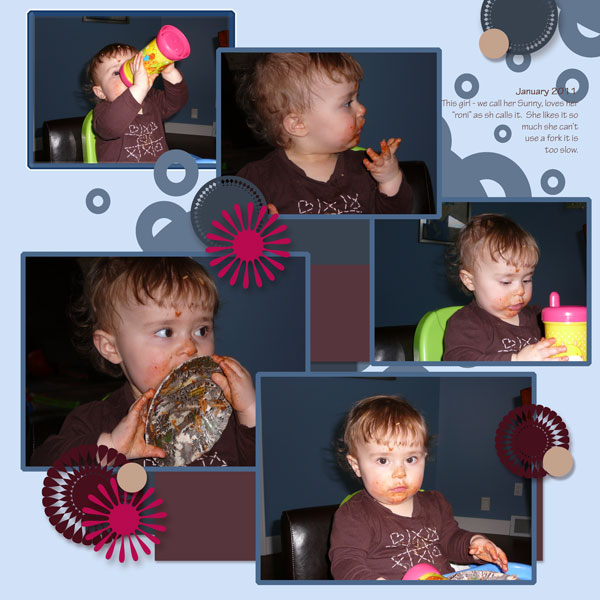
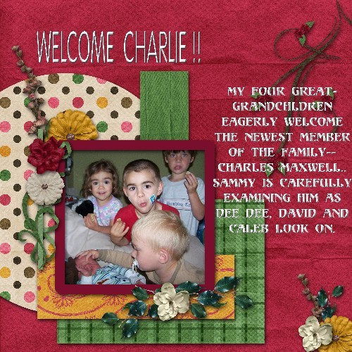
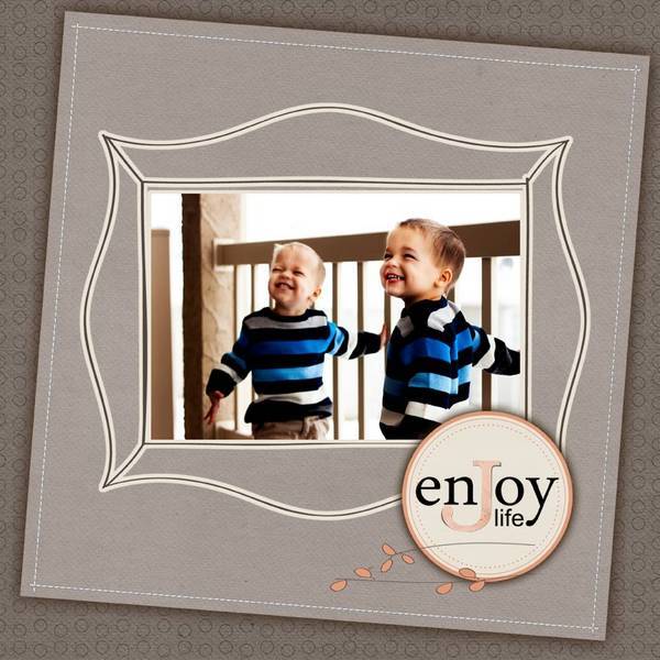
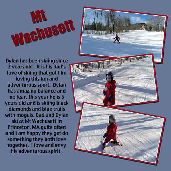
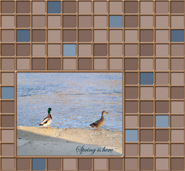
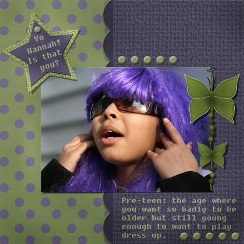
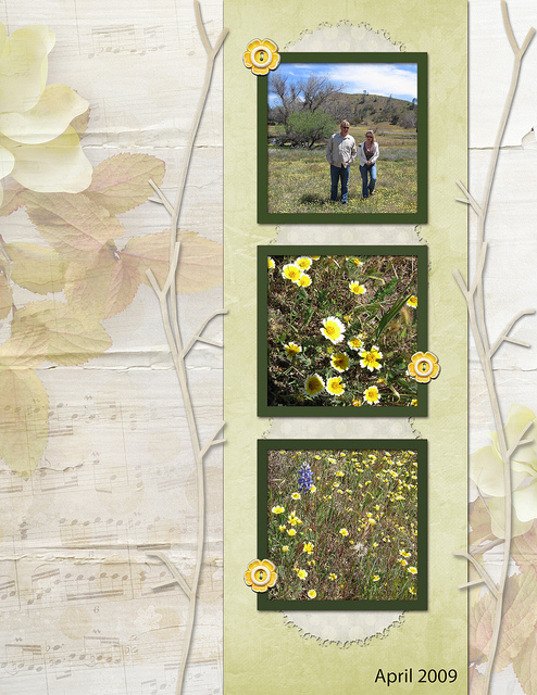
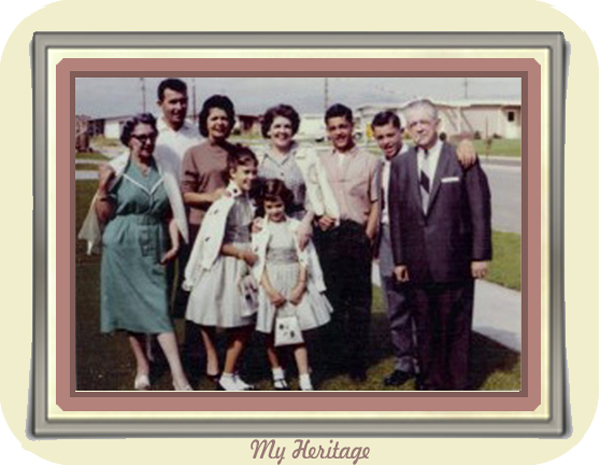
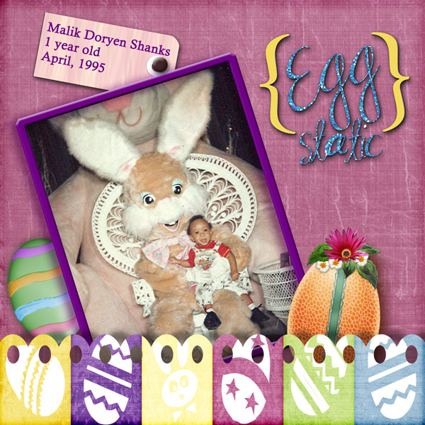
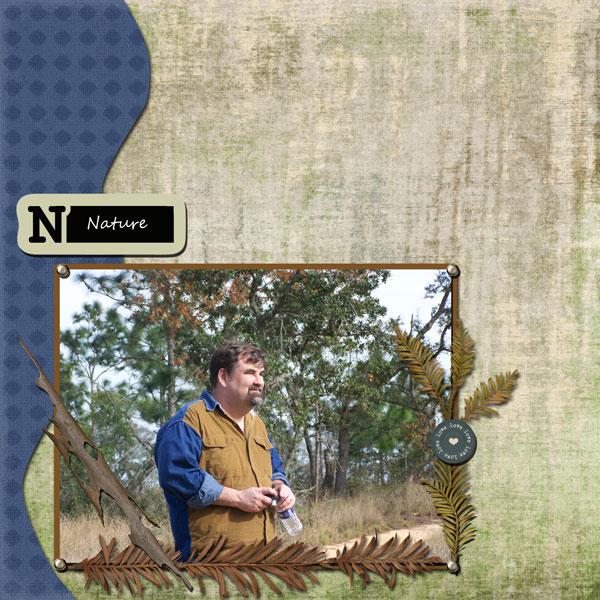
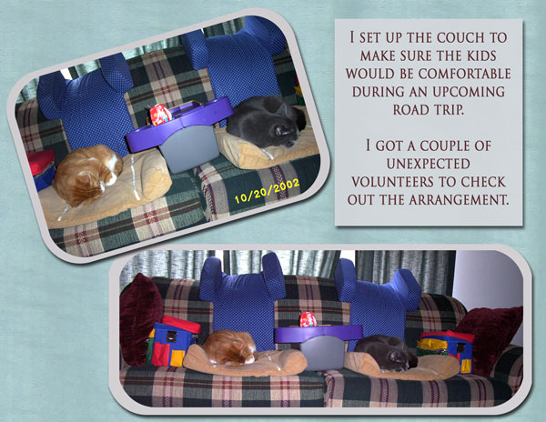
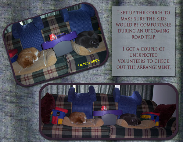
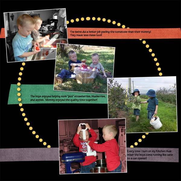
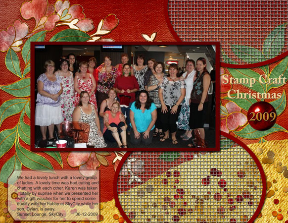
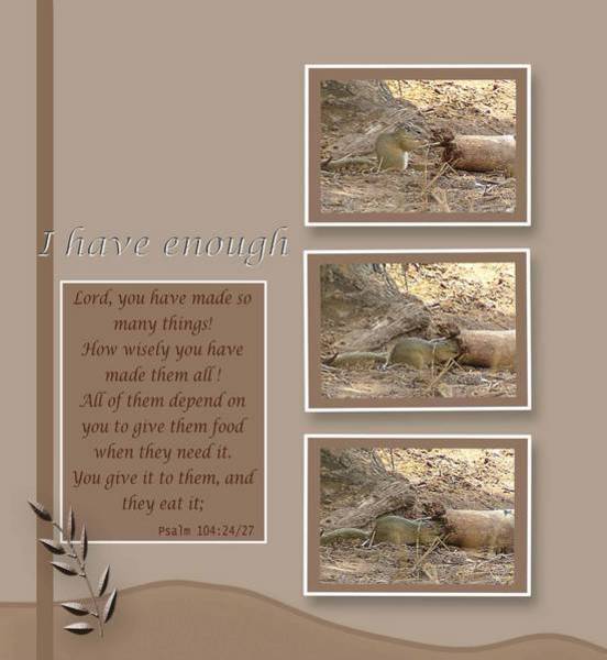
Here are your digital scrapbooking layouts!